Rover is a British car label, which production was ceased in 2005. The company was formed in 1878 and has been a part of Leyland Motor and BMW during its history.
Meaning and history
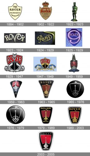
Rover was established as a factory of bicycles and only in 25 years, in 1904, the brand produced its first car. The brand became instantly popular and got a leading position in the British automobile market.
1884 – 1902
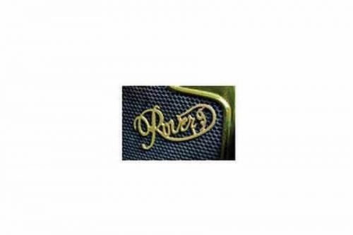
The original Rover visual identity was based on a shield-like emblem with cursive lettering on it. The emblem features gold color with the black of the wordmark.
1902 – 1922
The logo, created in 1902 had a classy and fancy crest shape with slightly curved corners and a traditional golden and red crown on top. The lettering on the golden background also used red shade, along with black. There were no other decorative elements rather than the crown, but two different styles of lettering made the badge look elegant and unique.
1922 – 1923
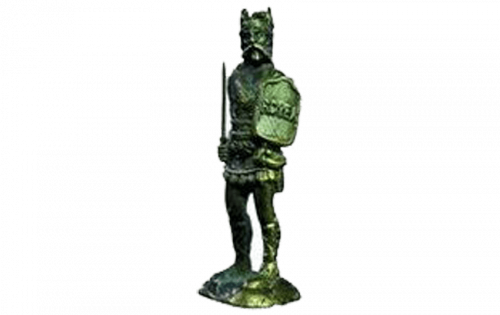
For one year, in 1922, Rover used another type of badge for its cars. It was a figure of a man, wearing like a knight, with a shield in his hands. The uppercase “Rover” inscription was written over the shield. The whole composition was executed in silver metal and looked pretty weird for the automaking industry.
1923 – 1924
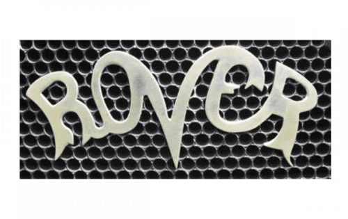
A cool and modern logo based only on the name of the brand was in use for another few months in 1923. It was a custom handwritten logotype, executed in silver metal, and placed straight on the grille of the Rover cars. The mix of upper and lowercase letters was accompanied by a smooth stylized “V” with its bars arched to the sides and their ends merging into “O” and “E”.
1924 – 1929
The first major Rover logo redesigned was made in 1924. The brand changed its shield emblem to a gold handwritten wordmark.
1925 – 1929
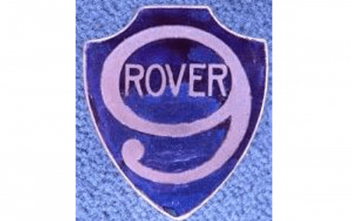
A blue and white crest saw the light in 1925. In the classy dark blue shield, there was a bold white digit “9” with the uppercase “Rover” lettering placed inside the circular negative space of the digit. The lettering was also executed in white and used a custom sans-serif typeface with slightly narrowed letters. The thin white outline of the crest balanced the look of the logo and made it bright and eye-catching on any background.
1929 – 1947
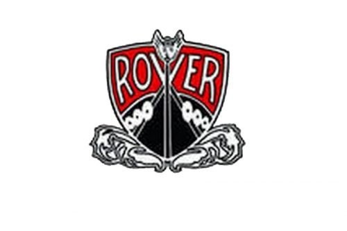
The new logo was created in 1929, it was composed of a red and black colored shield with silver big “Rover” lettering. The logo was modified through the years, colors of the nameplate and details were switched to gold and blue was added to the palette.
1947 – 1949
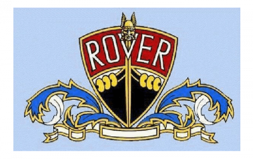
The logo was cleaned and strengthened in 1947. Blue waves appeared on the sides of the red, black, and gold stylized clipper. The curved white ribbon in an ornate golden outline was placed under the badge with waves, creating a feeling of the completed image, and adding some lightness to the badge, along with a sense of loyalty and trustworthiness, evoked by the white color.
1949 – 1959
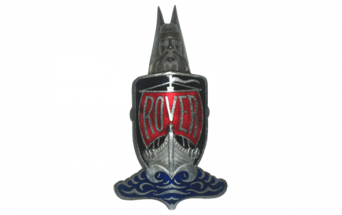
The helmet head became bigger in 1949. And now it was placed over the black badge with a silver clipper on it. The clipper had a Scarlett red sail, where the sans-serif “Rover” logotype was written in silver. The whole composition was “standing” on blue and silver waters, looking vivid and fresh on the glossy surface of the badge.
1959 – 1963
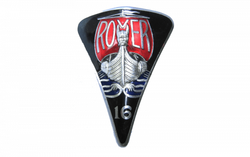
The shape of the logo was changed to triangular in 1959. The shield was pointing down, has its corners softened two sides arched to the center, and the upper side from the center. The silver and red clipper with the lettering got the silver head back and was placed on a glossy black background of the modernized crest in a thin silver outline.
1963 – 1965
In 1963 Rover changes the shape of its emblem to a more Art-Deco style figure, which is a trapezoid, extending up. The color palette remains black, red and gold, but the lettering now is more delicate and sophisticated. Placed on the top of the emblem.
1965 – 1976
The logo from 1965 was executed in a completely different style. It was a matte black circular badge with a clipper outline in silver on it. No other colors, no lettering. It was minimalist and futuristic, with the head in helmet drawn in the middle, and resembling a skull, depicted on the sails of the pirate ship. Something new and very interesting for the brand.
1976 – 1979
The new round shape of the Rover logo was created in 1965 and slightly modified in 1976. It was composed of a silver image of the ship on a black background.
1979 – 1989
The logo from 1963 was brought back in 1979 in a new shape with emboldened modernized contours. Now the black, red, and golden composition was drawn in gradients over a trapezoid badge with rounded angles and a double black and white outline, which added lightness to the badge.
1989 – 2003
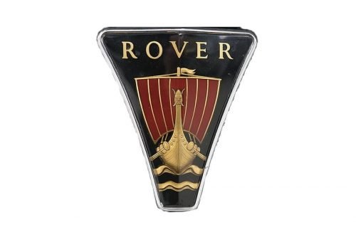
The brand switched back to the logo version of 1963, but the shape is changed – the trapezoid became thicker and the sides are curved. The color scheme and the wordmark remain similar.
2003 – 2005
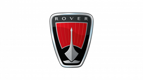
The Rover logo 2003 and was fully based on the previous design, but with a gold color replaced by silver. The ship icon is more abstract and modern and the logo looks stronger than ever.
The Emblem
During its long history, the brand always used a Viking longship image on its emblems. In the early years, it was more ornate and colorful and the latest versions of the Rover visual identity feature stylish and modern gold-colored ship with a red sail.
The longship symbolizes freedom and movement. It is a bright and powerful element of the Rover identity, which makes the brand recognizable and meaningful.


