Renault Korea Motors is a subsidiary of the French automaker Renault S.A., specializing in the manufacturing and sale of vehicles. Owned by the Renault Group, it was established to cater to the South Korean automobile market. The company primarily operates within South Korea but also exports cars to different countries. It offers a range of vehicles, including sedans, SUVs, and electric cars, designed to meet the diverse needs of consumers.
Meaning and history
Renault Korea Motors was established as a subsidiary of the Renault Group, a French multinational automotive manufacturer, to focus on the South Korean market. Over the years, the company has launched a variety of vehicles including sedans, SUVs, and electric cars, targeting various consumer needs. One of its significant achievements has been the adaptation of Renault’s global models to suit local preferences, as well as venturing into electric vehicles to align with environmental sustainability. Currently, Renault Korea Motors not only caters to the domestic market but also exports its vehicles, playing an integral part in the Renault Group’s global operations. Its position in the market is noteworthy, given South Korea’s highly competitive automotive industry.
What is Renault Korea Motors?
Renault Korea Motors is a South Korean subsidiary of the French automaker Renault S.A. The company specializes in manufacturing and selling a diverse range of vehicles, including sedans, SUVs, and electric cars, primarily for the South Korean market. It also exports vehicles to various countries and is a key player in the Renault Group’s global strategy.
1994 – 2000
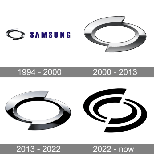
The company was founded jointly by Samsung and the automaker Nissan, which is why the Samsung logo is part of the company’s logo. The Samsung logo consists of only the name printed in dark blue. To the left, there is a metallic silver oval shape that is cut and displaced diagonally, while preserving a perfect oval shape in the center. This technique gave the emblem dynamics and interest. The metallic silver and three-dimensional appearance of the oval emblem reflected the company’s desire to stay current with advanced technologies.
2000 – 2013
The company removed the Samsung logo and left only the oval emblem. To make the logo a little more modern, the designers muted the silver color, so it was not as shiny anymore. The emblem turned out very stylish and its minimalistic design allowed the company to use it on its own for a little over ten years without making any modifications.
2013 – 2022
Although the shape of the emblem has not changed since 2000, the emblem did look different. It was all due to a different shading. The lines between lighter and darker shades were no longer as straight and clean. In addition, the silver color looked cooler, similar to the emblem in the 1994 version. Just like the previous version, this emblem looked stylish and sophisticated.
2022 – now
The logo that represented the company for several decades was turned into an abstract version. First of all, the color has been changed to black and white. The white line was going between the black lines on either side of it. This made it appear as if it was an automobile road. The logo turned out bold and modern but lost its sophisticated and luxurious feel.


