Capri Sun is a Swiss brand of a beverage, which was created in 1969 and today is being distributed across the globe. The label, owned by Rudolph Wild Ltd, is well-known and recognizable worldwide.
Meaning and history
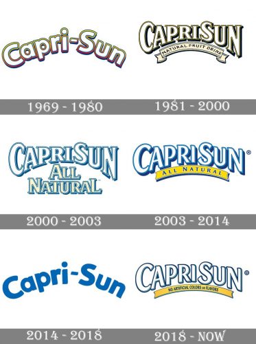
Though the Capri Sun logo has never had bright graphical additions or fancy framings, there was one thing, that unites all the versions of its emblem, and makes them recognizable across the globe — all of the logos were arched.
What is Capri Sun?
Capri Sun is the name of a juice brand, which was established in Germany at the end of the 1960s and today is distributed all over the globe by different large companies in different countries. The product line of the brand includes seven categories, with about 40 options of flavors.
1969 — 1980
The very first logo for Capri Sun was introduced in 1969 and boasted a fancy rounded inscription, where two parts of the wordmark were separated by a “-“ sign. The letters were drawn in white and featured a sleek outline in yellow-to-purple gradient. It was a color palette, resembling summer, fruits, and fun, just a perfect representation of a brand. The arched logotype has both of its parts written in a title case.
1981 — 2000
The redesign of 1981 made the logo look more professional and strong. The wordmark was now written in a bold traditional serif font, two parts were placed close to each other without any spaces or separations. White letters had a double black outline and were placed on a light blue background, with an arched ribbon, comprising “Natural Fruit Drink” inscription.
2000 — 2003
The color palette remained the same, yet the composition was switched. The white “CapriSun” wordmark was outlined in blue, and the “All Natural” tagline, executed in the same serif font, was drawn in light yellow and featured the same blue contouring. The logo looked balanced and airy, evoking a sense of freshness and sweetness.
2003 — 2014
In 2003 the “All Natural” part was placed on a yellow ribbon, located under the main wordmark, and arched to the top. The blue of the outline became brighter and more intense in order to make the logo look more confident and memorable.
2014 — 2018
The typeface of the lettering was refined in 2014. The lines became smoother and shorter, while the color of the outline gained gradient shades and was now executed in dark and light blue. The yellow arch was removed from the logo, so the composition was pretty simple, yet elegant.
2018 — Today
The refinement of 2018 included two major things — the come back of the yellow ribbon, and the new smooth and modern typeface. The lettering on the ribbon is saying “No Artificial Colors or Flavors” and is executed in dark blue capital letters of a strict and simple sans-serif typeface. As for the main nameplate, it has all letters outlines in dark blue with some light accents.
Font and color
The smooth and elegant lettering from the primary Capri Sun logo is set in all capitals with the “C” and “S” slightly enlarged. The inscription is set in a custom sans-serif font with softened lines and angles, but some of the ends of the bars are delicately pointed.
As for the color palette of the Capri Sun visual identity, it is very light and fresh, based on a blue and white combination for the logotype, and bright yellow for the underlining ribbon. The colors of the wordmark show the “refreshing” side of the brand’s drinks, while the ribbon represents the intense and warm color of the Sun and the heat.


