 Campeonato Brasileiro Série A Logo PNG
The Campeonato Brasileiro Série A logo showcases a gold and silver trophy. The stylized football that is placed in the middle of the design leaves no doubt as to what field the organization works in. The overall look of the logo is quite unusual and futuristic.
Meaning and history

Campeonato Brasileiro Série A is known as the top echelon of the Brazilian football league system.
2002 – 2011
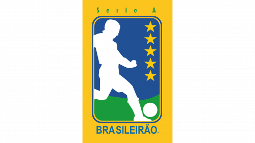
The original logo depicts a tall, yellow rectangle with another rectangle inside. The latter has a blue background with some green on the bottom (for grass), as well as a white silhouette of a football player on the left. 5 golden stars are also featured along the right edge of the figure. There’s also a green word ‘Brasileirao’ written right below the central rectangle.
2011 – 2015

The 2011-introduced logo depicts a blue ball with green-and-yellow trails to its left (the coloring refers to the Brazilian flag). Below it all, there’s also the word ‘Brasileirao’, written in bold, golden letters with some glint.
2014

The logo for the 2014 season is pretty much just a long inscription. It’s a single line that says ‘Brasileirao Chevrolet 2014’, as well as ‘Serie A’ in smaller letters inside a yellow rectangle beside the main thing. The coloring is 50/50 grey and black.
2016 – 2021
The golden shape in the central part has a sharp end pointed upwards and two obtuse angles. On the background, there’s an abstract shape filled with a grey gradient. The design is placed inside gold and dark blue rings housing the lettering “Serie A” in white.

The 2021 logo is a lot like the previous emblem, except colored gold. They also replaced the football image in the center with a blue circle that said ’50 years’ in Portuguese. The other addition is the ‘Assai 2021’ writing below the main wordmark in the lower part of the logo.
2022 – Today
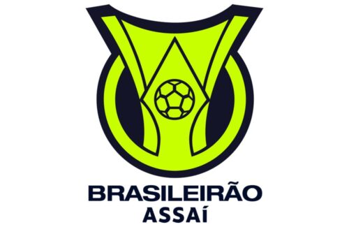
The logo got modernized in 2022 to appeal more to the younger population. The shapes of the previous emblem were preserved almost unchanged, but the color palette was changed drastically. it now had neon yellow as the main color with black serving as an accent. It was used for the background of the inner circle which no longer had the golden ring. The whole shape got a wide black outline going around its outer perimeter. To go with the emblem above, the inscription below was also done in black. It was now accompanied by a second line that said “Assai” using the same font.


