 National Womens Soccer League Logo PNG
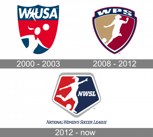
The National Women’s Soccer League logo uses the same approach as, for instance, the Major League Baseball logo. It comprises two fields, red and dark blue, with the “border” formed by the figure of a player. In this case, the player is a female ready to kick a soccer ball, which is also present on the NWSL logo. The dark blue field, which is on the right, houses the abbreviation “NWSL.” The overall shape of the logo is pentagonal. Over the central image, there’re white and silver outlines.
Meaning and history
The National Women’s Soccer League (NWSL) was founded in 2012 as a successor to the Women’s Professional Soccer (WPS), with its inaugural season taking place in 2013. This establishment marked a significant step in the evolution of professional women’s soccer in the United States, providing a stable and enduring platform for the sport. The league was formed through a collaborative effort between the United States Soccer Federation, the Canadian Soccer Association, and the Mexican Football Federation. These organizations aimed to create a sustainable environment for professional women’s soccer, with a focus on nurturing home-grown talent and providing a competitive stage for international players.
Over the years, the NWSL has celebrated numerous achievements, contributing immensely to the growth and visibility of women’s soccer. It has been instrumental in developing world-class talent, many of whom have gone on to achieve international acclaim. Notably, players from the NWSL have significantly contributed to the successes of the U.S. Women’s National Team, including their victories in the FIFA Women’s World Cup. The league has also expanded in terms of teams and fanbase, showcasing the increasing popularity and commercial viability of women’s soccer in the U.S. and abroad. The league’s partnerships with major broadcasters and sponsors have further elevated its profile, making it a benchmark for women’s professional sports leagues globally.
As of now, the National Women’s Soccer League stands as the premier women’s soccer league in the United States. It continues to grow, both in terms of talent and commercial success, attracting top players from around the world. The league’s current position is not just a testament to its past achievements but also a beacon of potential for the future of women’s professional sports. With an ever-increasing fanbase, innovative approaches to fan engagement, and a commitment to player development and welfare, the NWSL is poised to maintain its status as a leader in the world of women’s professional soccer.
What is National Women’s Soccer League?
The National Women’s Soccer League (NWSL) is a professional women’s soccer league in the United States, renowned as the highest level of women’s soccer in the nation. Established in 2012, the league represents the pinnacle of women’s professional soccer, featuring teams comprising of both national and international players. The NWSL is celebrated for its high competitive standards, contributing significantly to the development and popularity of women’s soccer both domestically and internationally.
2000 – 2003

The original logo is a shield shape, colored variably in blue and red. The top blue bit is taken up by the acronym – ‘WUSA’ written in big, white letters. Besides that, there’s also a star between ‘W’ and ‘U’, creating a slightly larger gap. The bottom of the shield is occupied by a minimalistic figure of a female soccer player, and a ball above her.
2008 – 2012

A wider shield was adopted in 2008. This time, its core was 50/50 yellow and red, outlined by some white, then a thick layer of blue and then some red. The blue layer extended into a block on top of the shield, where ‘WPS’ was written in squat, white letters. The center also held a figure of a female player, but in more detail this time.
2012 – Today

Below, the full name of the league is given in dark blue. The type used on the National Womens Soccer League logo is a regular italicized serif one.


