Cadbury is a famous chocolate brand from Great Britain, which was established in 1824 and today is owned by Mondelez. The label produces various confectionary products that are highly popular all over the world.
Meaning and history
The history of the company began in 1824, when John Cadbury started selling tea, coffee, and drinking chocolate in his shop in Bull Street in Birmingham, England. Today, it is the world’s second-largest confectionery brand. It is wholly owned by Mondelez International (formerly Kraft Foods).
What is Cadbury?
Cadbury is the name of a large confectionery company from the United Kingdom, which was established in 1824, and named after its founder, John Cadbury. Today the company, which owns several well-known brands of chocolates and snacks, is a part of the Mondelez International Group.
1824
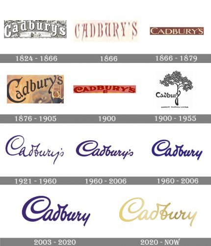
The original Cadbury logo featured the name of the brand in bold and rounded letters with pronounced serifs. Each of the glyphs was drawn specifically for the wordmark and had a unique touch. Note, for instance, the curls on the “y” and “r,” the rounded body of the “a,” etc.
And yet, the type was not overloaded with details.
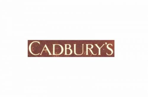
1866
This version was more elaborate. Each character had plenty of decorative details, including the picturesque curls and extended ends, the play of the thicknesses of the strokes, and the unpredictable curves and slopes (in the “A,” “U,” and “R,” for instance).
However, the overall structure of the glyphs remained traditional and perfectly legible.
1866 (second version)
This was a simplified one. While the letters stayed unique enough, the more elaborate details disappeared. Some of the letters were unusually wider than others (compare, for instance, the “D” with the “B” or the “U” with the “R”).
Both the versions introduced in 1866 used a brown background reminiscent of the color of chocolate.
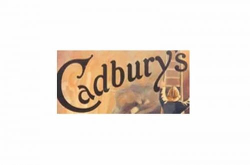
1876
A completely different type was used. This time, it was lowercase (except the initial) and looked more like the original wordmark than its more recent predecessors. The serifs were replaced by decorative curves and strokes. Also, the wordmark was positioned diagonally (rising from the left to the right).
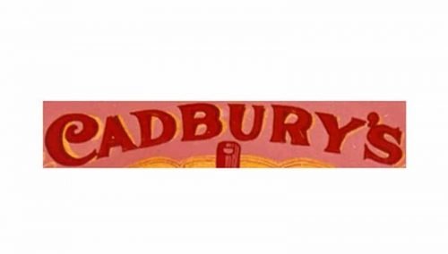
1900
This version was arched. The letters were red over the pink background. The typography was again a new one. The letters were bolder and capitalized. They remained very legible.
1905
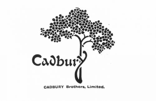
This version has been often referred to as the first “real” Cadbury logo (maybe because it was the first one made by a well-known person). William Cadbury chose Georges Auriol for his work. Apart from being a type designer and Art Nouveau artist, Auriol was also a poet and songwriter.
Auriol drew a stylized cocoa tree. The “y” of the brand’s name formed an additional stem thus making the word part of the picture. We can add that although the wordmark this time looked stylish and unique, it was also not as legible as the previous ones. This is why the primary version had to include the full name of the company.
This logo, however, was widely used in 1911-1939 (on the aluminum foil in which the chocolate bars were wrapped, in catalogs, etc.). The company returned to this design even after WWII.
1921
What was to become the company’s primary logo was initially used as a secondary mark on the transport fleet. Interestingly, the script logo is believed to have been based on William Cadbury’s signature.
In other words, it turned out that the signature of the owner eventually proved to become a better-known logo than something drawn by a professional. However, it was only in 1952 that the company started to use it across major brands.
We can also add that the original script was a little richer in detail, which even worsened the legibility problem characteristic of this wordmark (even the current one!).
1960
Several excessive curls were removed, while the letters in the second half of the word were slightly straightened. At the same time, a version without the “s” was introduced. It was slightly bolder, and the letters had a little different shape. The overall style was the same, though.
2003
There has been some experimenting with the Cadbury logo over the previous two decades. You can come across the purple and gold version, the wordmark on the white background, and inside a “liquid” purple shade, with or without the gradient.
Yet, the script has remained almost unchanged. It is almost impossible to distinguish between the versions unless you compare them side by side.
2020
The redesign of 2020 has kept the iconic Cadbury inscription as the only element of the logo, but switched its color from purple to gradient gold, making the lines of the letters slimmer and more elegant. The new color scheme of the wordmark added sophistication and timelessness, showing the long history of the brand and not leaving any doubts about its prosperous future.
Font and color
The sophisticated cursive lettering from the Cadbury primary badge repeats the signature of the brand’s founder, hence using a custom designer typeface, which doesn’t have any commercial analogs. The closest font to the one used in the Cadbury insignia is, probably, Bickley Script Std, but with most of the contours modified.
As for the color palette of the Cadbury visual identity, after the redesign of 2020 gold has become the main shade of the logo, evoking a sense of elegance, sophistication, and excellence.


