

![]() Krispy Kreme Logo PNG
Krispy Kreme Logo PNG
While being rather consistent in its shape and style throughout its 80-year history, the Krispy Kreme logo hasn’t remained exactly the same.
Meaning and history
![]()
For the company, which is on the international market for more than 80 years, Krispy Kreme is impressively conservative with its visual identity design. The famous doughnut brand uses the logo, introduced in 1937, with only slight modifications, made in 2017.
The logo, created for the company in 1937 featured a geometric badge in white and green, where the bottom line was thickened, and the upper one created an angle, making the right and left sides of the emblem spread and resemble stylized wings.
1937 – 1978
![]()
The company approached the design of its logo very creatively. The name was printed using a very elegant cursive writing style. Both “K”s were done very similarly and placed just a bit lower than all the other letters, while the top stroke was extended to be the same length as the whole word. The oval symbol above the inscription looked like a cherry on top of the cake. it was the same deep crimson color as the letters and held to light grey “K”s. The latter were stylized as smiling characters with crowns, two feet, and an extended hand(s) holding a round donut. It was a fun and memorable addition to the logo that implied that these donuts are loved even by kings or one would feel like a king if they had Krispy Kreme donuts.
1978 – 1991
![]()
In this one, they’ve wrote the brand’s name in white letters using a peculiar sans-serif font with wavy, tilted forms. It was put into a red figure shaped like a boat (a wide rectangle with two slopes leading into a depression above). Instead of the sail, though, there was a red circle with two ‘k’ letters in it. They looked normal, save for two dots above the left bars, as if these are ‘i’ letters.
1991 – 2017
![]()
The main wordmark was placed in the middle of the badge, executed in a custom cursive font with the lines of both “K”s elongated to the right. The left line had a spot outlined in white on it, above the letter “I”.
The “Doughnuts” part of the nameplate was written in white capitals in a simple and clean sans-serif along the green bottom line of the badge.
2017 – Today
![]()
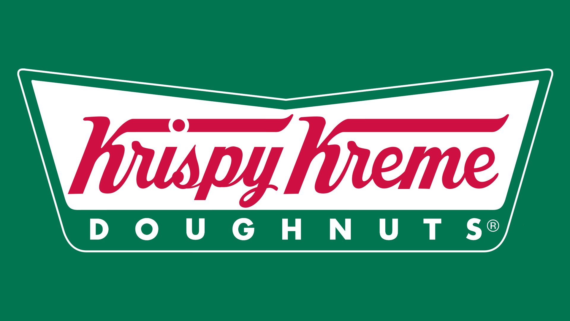
The redesign of 2017 refined the lines of the inscription and brought only one noticeable change to the Krispy Kreme logo — its thick green bottom line is now replaced by a stretched banner with rounded angles, which is placed on a thin line. It is colored in green and has the same white “Doughnuts” lettering in it, but a more compact one, with less space between the letters.
The green, red and white color palette is not only a stylish and bright combination, which makes the logo stand out but also a reflection of love, passion, and success, the qualities the brand values most.
“KK” symbol
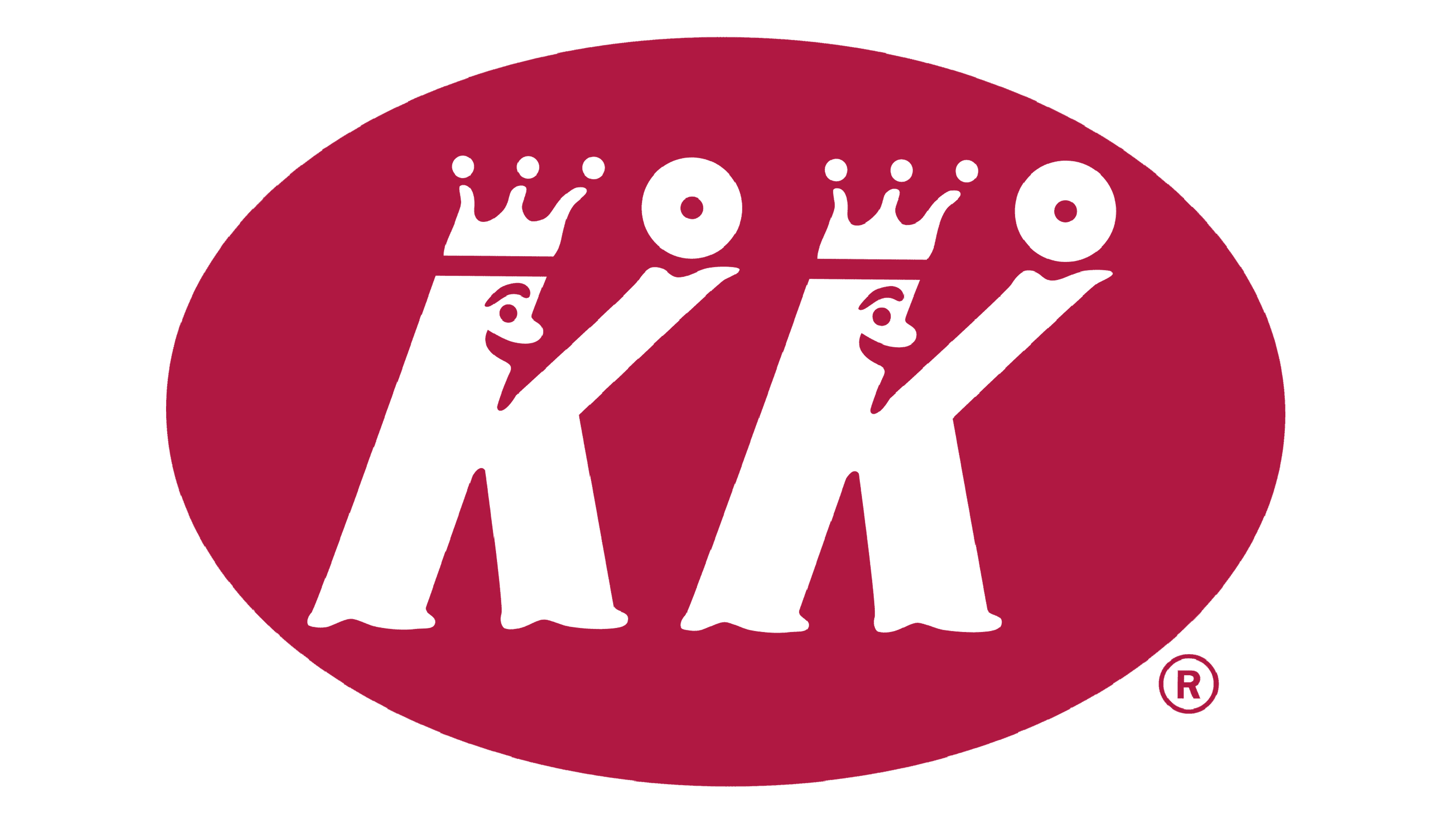
Another emblem used by the company sports two letters “K” looking like two crowned manikins wearing shoes. Both of them are “holding” doughnuts in their “hands” (the top left ends of the “K” glyphs). The symbol can sometimes be seen above the primary wordmark logo.
Emblem
The current emblem is an updated version of the original one. It still features a beautiful handwritten script. Now, both the letters “K” have their top left ends extended, while the line below the text has disappeared. Below the red lettering “Krispy Kreme,” there’s the word “doughnuts” in white on the green background. The wordmark is placed inside a green frame looking like the top of an open book or open wings.
Font
The Krispy Kreme logo appears to have been drawn by hand as it’s impossible to find a font that looks exactly the same. However, such types as Futura Bold and FreeHand 521 look somewhat similar.


