The franchise that is currently known by the name of the Jacksonville IceMen has had a long and full of events history including ownership changes, name changes and relocations. The predecessors of this ice hockey team were the Muskegon Fury (1992-2008), the Muskegon Lumberjacks (2008- 2010) and the Evansville IceMen (2010- 2016). At present the club resides in Jacksonville, Florida.
Meaning and history
The Jacksonville IceMen, a professional ice hockey team based in Jacksonville, Florida, was founded by a group of investors led by Ron Geary in 2014. Initially, the team was located in Evansville, Indiana, and known as the Evansville IceMen. They relocated to Jacksonville in 2016, marking a significant transition in their history. The IceMen compete in the ECHL and serve as a feeder team for the Winnipeg Jets of the NHL and the Manitoba Moose of the AHL. Over the years, they have gained a reputation for nurturing talented players who go on to achieve significant success in higher leagues.
Throughout their journey in the ECHL, the Jacksonville IceMen have strived for excellence on the ice. While they have not yet secured a championship title, their consistent performance and determination have earned them a respectable position within the league. They have become known for their spirited gameplay and have developed a dedicated fan base in Jacksonville. The team’s main achievements include making the playoffs and providing a platform for emerging players to showcase their talents at a professional level.
As of now, the Jacksonville IceMen continue to compete in the ECHL with aspirations of achieving greater success. They remain a pivotal part of the Jacksonville sports scene, contributing to the city’s rich sporting culture. The team’s current focus is on building a stronger, more competitive squad capable of vying for the league’s top honors. Their ongoing efforts to enhance team performance and engage with the community exemplify their commitment to excellence both on and off the ice.
What is Jacksonville IceMen?
The Jacksonville IceMen is a professional ice hockey team competing in the ECHL, known for developing talent for higher leagues and contributing significantly to Jacksonville’s sports culture.
1992 — 1997
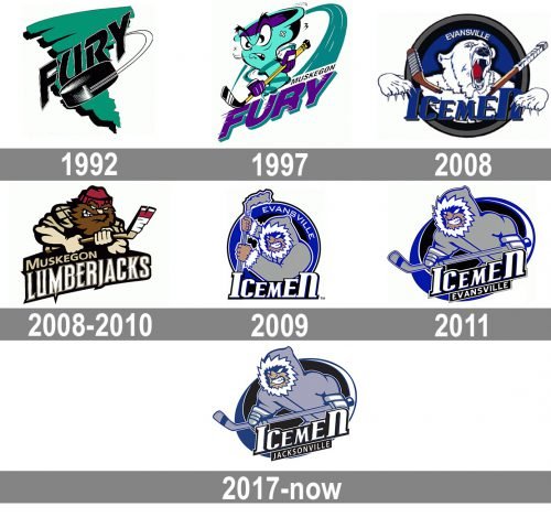
The team, which today is known as Jacksonville Icemen, was established as Fury, and its two first logos were based on the original name. The initial Fury emblem featured an emerald green background, repeating the shape of the triangle pointing down, but executed in a thick line, resembling a hurricane swirl. The black bold lettering was set diagonally over the green element and had an enlarged image of the hockey puck, also in black, placed under it.
1997 — 2007
In 1997 the club gets a mascot — a funny angry figure in turquoise and purple, which also resembles a hurricane swirl. The wordmark was now drawn in purple with a turquoise shadow and placed under the emblem, with a thin white banner and black “Muskegon” tagline placed over the last letters.
2008 — 2009

The first logo with the word “IceMen” appeared in 2008 when the new name was unveiled. It features a fierce looking Yeti-like creature that looks as if it is going to tear you to bits. Just look at the broken hockey stick. No wonder the logo was replaced in a year, yet by something that looks no less scary ‒ a man with bared teeth and angry eyes raising his hockey stick at somebody. It was adopted, though.
2008 — 2010
In 2008 the name of the team was changed to Muskegon Lumberjacks, and the logo was changed again. The new concept included an image of a bearded man with an ax stylized as a hockey stick. The man was placed above the narrowed and stylish lettering, where the “Lumberjacks” part was enlarged and written in white letters under the beige “Muskegon”.
2009 — 2011
Two seasons later the IceMen altered their logo ‒ the man in it looks like a forward player in action.
2011 — 2016

The redesign of 2011 refined the Icemen badge and made it more modern and strong. The color palette was simplified and the shade of blue, used for the logo became softer and colder. The lettering was now set diagonally over the bottom part of the circular emblem.
2017 — Today
The last redesign was in 2017 due to the team’s relocation to Jacksonville. Evidently, they didn’t want to change the identity that was so familiar to fans, so only the city name was replaced in the wordmark.
The team color scheme includes navy blue, sky blue and white. They also use black and gray in their logo.
