A team called the Buffalo Bisons started playing in Buffalo, New York.
Meaning and history
It’s perfectly natural that the animal featured on the logo of the baseball team the Buffalo Bisons is a bison. But in what way is the creature unique and how has it been evolving over the years?
1985 — 1987
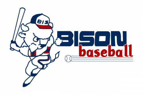
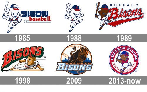
The first Buffalo Bisons’ emblem was designed in 1985 and stayed with the club for a couple of years. It was a caricature of a bison in the club’s uniform and cap, with the baseball bat in its hands. The animal was aiming to hit a ball, drawn on its right in thin contours, with four horizontal lines coming out of it to the right. The “Bison Baseball” wordmark was set above those lines in two levels, with the upper one enlarged, written in dark blue, and the bottom one in red, executed in a smooth playful font, in the lowercase.
1988
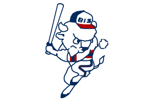
The ball, the lettering, and its underline were removed from the Bisons’ visual identity in 1988. Only the animal in blue contours is left in the logo. Another change was made to the bison’s cap — on the original version it was white with a blue “Biz” lettering, and now it changed to a blue cap with a red visor and a red capital “B” in the middle.
1989 — 1997
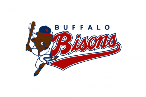
The body of the bison and the baseball bat changed their color to brown in 1989. Now the animal got a two-leveled inscription on its right again — the “Buffalo” in blue capitals of a modern sans-serif typeface, and the enlarged script “Bisons” in red with a double white and blue outline. It was a very bright and fancy logo, which stayed with the club for almost ten years.
1998 — 2008
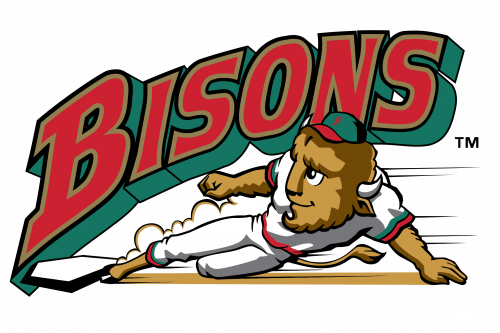
The redesign of 1998 introduced a completely new image as the official logo of the club. The bison was redrawn in a more modern manner. Now the animal was laying under the strong bold “Bisons” wordmark in all capitals with the first “B” enlarged. The lettering was executed in a strong square typeface, with the red letters having a thin gold outline and a moss-green shadow.
2009 — 2012
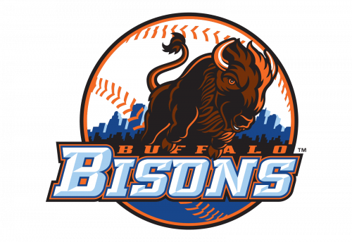
Another version was created for the club in 2009. It was a rounded badge, with a white and orange Baseball as the base. On the upper white part of the emblem, there was a very detailed and realistic image of bison in brown and black, while the bottom part of the ball featured a blue pattern, repeating the landscape of the city. Under the bison the wordmark in two lines was set: a slanted orange serif “Buffalo” in a square serif font, and a large light blue and white “Bisons” under it.
2013 — Today
Like the bison on the 1985 Buffalo Bisons logo, the current one is also holding a bat in its paws, but this time, its head is tilted less, and because of this simple detail the overall impression is very different.
Part of the International League, today Buffalo Bisons are now known as the Triple-A affiliate of the Toronto Blue Jays.


