Britney Spears, also known as the Princess of Pop, is a famous singer, who was born in 1981 in Mississippi and became popular at the end of the 1990s after the release of her “Baby One More Time” album. By today Britney releases nine albums and earned several very prestigious music awards.
Meaning and history
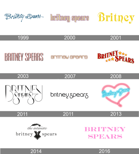
Throughout the years of her popularity, Britney Spears has had many completely different logo design to represent her versatility and universality as an artist. During the first decades of the career, the singer preferred bright and intense colors, which worked brilliantly for catching attention and staying in people’s memory. But as the time passed, the more confidence and strength appeared in her image and music, and this was also reflected in the logos, which began to be executed in monochrome.
1999
The very first logo was designed for Britney Spears in 1999 and boasted a fancy handwritten inscription in sea-blue. The sharp vertical lines of the letters were accompanied by the swirl-like curves of the horizontal tails. The wordmark looked unique and became instantly recognizable across the globe, being used for almost a decade, even after the creation of a new logo.
2000
In 2000 Britney Spears was using a very tender and feminine lowercase logotype in light yellow cursive with a blurred gradient dust-pink shadow, which added volume and created a very interesting color combination.
2001
The redesign of 2001 has introduced a shortened logo: it was only the “Britney” lettering, set in plain yellow against a white background, with the sophisticated designer typeface somehow resembling the lettering from one of the Barbie badges, with thin elongated tails of the characters and some curved elements.
2003
In 2003 the logotype was written in uppercase in a stylized geometric sans-serif font with narrowed characters and rounded angles of the contours. The inscription was set in a smooth and calm shade of pink, with a thin black outline and a delicate shadow, also in black.
2007
The logo, used by Britney Spears in 2007, was resembling a neon banner, with the soft yellow mixed case inscription in a modern sans-serif font, outlined and shadowed by smooth pink. This palette reminded the Britney badge from 2000, but in a more contemporary execution, which represented the growth of the singer.
2008
In 2008 some graphics were added to a bold red inscription. The lettering, which featured a custom serif typeface with thick sleek likes and delicate serifs, has six golden five-pointed stars as an extension of each part of the wordmark. The stars featured different sizes and reflected the chic and style of the pop-singer.
2011
In 2011 the Princess of Pop introduces her new logo, and it is something completely different from the previous versions. A luxury monochrome inscription in gradient shades Was set in two levels with the first and last letters of each word enlarged. The silhouettes of both “S” were elongated and looked elegant and exquisite.
Later in the same time period, another logo was designed — it was a black lowercase logotype in a custom sans-serif typeface with interesting contours and “broken” tail of the “Y”.
2011
The redesign of 2011 made the logotype lowercase again, and created a cool designer font for the simple black lettering, with most of the contours pretty traditional, but a couple of sharp geometric elements, which made it look unique and memorable.
2013
In 2013 the badge of the famous pop singer was made bright and cool. Another neon banner, with the blue cursive “Britney Spears” lettering placed diagonally inside a pink neon heart, with no extra elements.
2014
In 2014 Britney Spears launches her own brand of women’s lingerie, The Intimate Britney Spears, and introduces a logo for this label. The logo is composed of a light gray corset image, with “Britney Spears” in the lowercase set on both sides of the emblem. “The Intimate” lettering in an italicized cursive is set above it and adds sophistication and femininity.
2016
The Britney Spears badge from 2016 featured an uppercase inscription in two levels, set in bright pink, with the heavy extended characters executed in a sharp geometric serif font with large triangular serifs on the ends of the bars.


