

![]() Red Velvet Logo PNG
Red Velvet Logo PNG
Red Velvet is a South Korean girl band formed in 2014 and managed by SM Entertainment. The main office of the band is located in Seoul, South Korea. They sing generally in pop musical genres, such as K-pop, dance-pop, future bass, and 90-s influenced R&B with elements of jazz and ballad. The main theme of their songs, marketed generally towards worldwide teenager audience, is love. The group consists of five members: Irene, Seulgi, Wendy, Joy, and Yeri.
Meaning and history
![]()
The group’s first incarnation appeared in 2007, with the first member of the band invited by SM as a trainee. Initially, it was a cast of young female singers carried by SM Entertainment via audition. Irene and Yeri joined the band in 2009 and 2015 respectively. In 2012, Wendy and Joy were signed into the list of member after their success in Global Auditions held by SM in Canada in Korea.
The conception of the group was greatly reflected in its name: their ‘red’ side stands for their hip hop, funk, and electronic incline, while ‘velvet’ depicts their jazz, ballad and R&B experiments. The debut single was named Happiness and it was released in 2014. Its clip had a huge success with 2+ million views on YouTube in the first 24 hours.
What is Red Velvet?
Red Velvet is the girl band, was founded in 2014 by SM Entertainment and headquartered in Seoul, South Korea. It is a group singing in pop ganres, including dance-pop, R&B, electropop, and others. They have 13 extended plays, 26 single songs and 4 albums, generally sang for male and female teenager audience across the world. Their main theme is love and life. The group’s main members are Irene, Seulgi, Wendy, Joy, and Yeri.
2014
![]()
Their first single, Happiness, had a logotype depicting white ribbons with red contours. On the ribbons we can see the band’s name, written in a semibold serif typeface with small intervals between the letters. At the perimeter of the ribbons, we can see the ornamental sticks with leaves. Above, they drew a circle with a red inner part, a white external ring, and a red frame for the whole circle. Over the circle, there is an ‘rv’ monogram.
2014
![]()
The second single, Be Natural, had a black wordmark, depicting the brand name above the single name. They both had a slim typeface with large serifs. The two words had diagonal border in between. It came from the first ‘b’ character of the lower inscription to the last ‘t’ letter of the upper nameplate. Some letters were cut by this line.
2015
![]()
Another single, Ice Cream Coke, received a handwritten nameplate colored yellow. It was written with a slight upper incline.
2015
![]()
The first album, The Red, had got a red logotype, featuring the large ‘red’ caption written in lowercase letters, and the small ‘the’ word written in an area inside the ‘r’ letter.
2016
![]()
The release of the band’s 2016 album, The Velvet, was accompanied by the logotype colored pink. It was a wordmark with typoical lowercase letters. The two ‘v’ characters had their bars going not to the center but to the lower right of left corner respectively. Inside the first ‘v’, they placed the small ‘the’ text in a capitalized sans-serif typeface.
2016
![]()
The ‘Russian Roulette’ album logotype was a white nameplate with a pink outline and styled as a an arrow piercing a beige heart with a pink contour.
2017
![]()
In the ‘Rockie’ album, Red Velvet used the logotype with the pink ‘Rockie’ inscription, written in a bold cartoon-styled typeface, and put above the handwritten ‘nameplate colored bright blue.
2017
![]()
For the group’s album named ‘The Red Summer’, the designers of Red Velvet brand identity had prepared the special logotype. It consisted of the large and bold ‘red’ word. Above the ‘e’ letter, they drew ‘the’ word in the same font. The whole inscription had two outlines colored orange and white. Below the word, we can see the ‘summer’ word’ with a bright blue typeface equipped with two contours o orange and white shades. At the bottom, they put the handwritten ‘Red Velvet’ inscription colored black.
2017
![]()
This black, yellow & white logotype was used for the band’s album named ‘Perfect Velvet’. It was a rectangle with the album’s name in the middle and the band’s name above it. The first one had a heavy typeface with uppercase characters. The first characters of each word in this caption were enlarged. The group’s nameplate had a handwritten font.
2018
![]()
Another logo design came up with their ‘The Perfect Red Velvet’ album, released in 2018. It was another wordmark with the letters written in a comicbook style. The red characters were very bold, and there was a black shadow coming from them.
2018
![]()
For the logo of their Japanese album named ‘#Cookie Jar’, they’ve put the band’s pink nameplate in a semicircle with two thin contours and some ornamental figures. Below it all, we can see a large stripe with the album’s name, written in a capitalized gothic typeface. The name is white, and it has some pink contours. The stripe is pink, at it also has thin pink outlines.
2018
![]()
The again used a handwritten typeface for the album logotype. In this logo, the bright blue ‘Red Velvet’ inscription was located above the yellow ‘Summer Magic’ lettering.
2018
![]()
The upcoming of their ‘RBB’ album was attended with a logotype consisting of a black rectangle, on which they drew the band’s white name in a typeface with very thin a long lines coming from the characters. The ‘RBB’ acronym received a heavy serif font with uppercase letters. There was a trace of a tiger claw hit on the first ‘b’ letter.
2019
![]()
Another album, Sappy, was gained the logotype with a red line featuring the white band’s white name. It had a 3D typeface with angular sans-serif characters. The first letters had a special design – their tails were rounded and elongated. Below, we can see the names of the band’s members colored red. Upper the line, they drew the ‘Sappy’ word in a circular position, and the ‘2’ number standing for the number of the album recorded in Japanese.
2019
![]()
The ReVe Festival Day 1 logo was composed of the ‘Red Velvet’ inscription, colored surprisingly red. It had a smooth and rounded typeface. The initial ‘R’ letter had a very long lower tail, crossing the rest of the word. Above the lettering, there was a robot’s blue head, like it’s in the cartoon movies. Under the name caption, they drew the festival’s name.
2019
![]()
In the Day 2, they had painted the logo pink and removed the robot’s head. The festival’s name was changed to the pink capitalized ‘r v f’ characters.
2019
![]()
Then, they blackened the logo, downsized the ‘Red Velvet’ lettering and put it above the black ‘The ReVe Festival Finale’ wording, whereas the lower ‘finale’ word is light, while the rest of the letter – bold.
2021
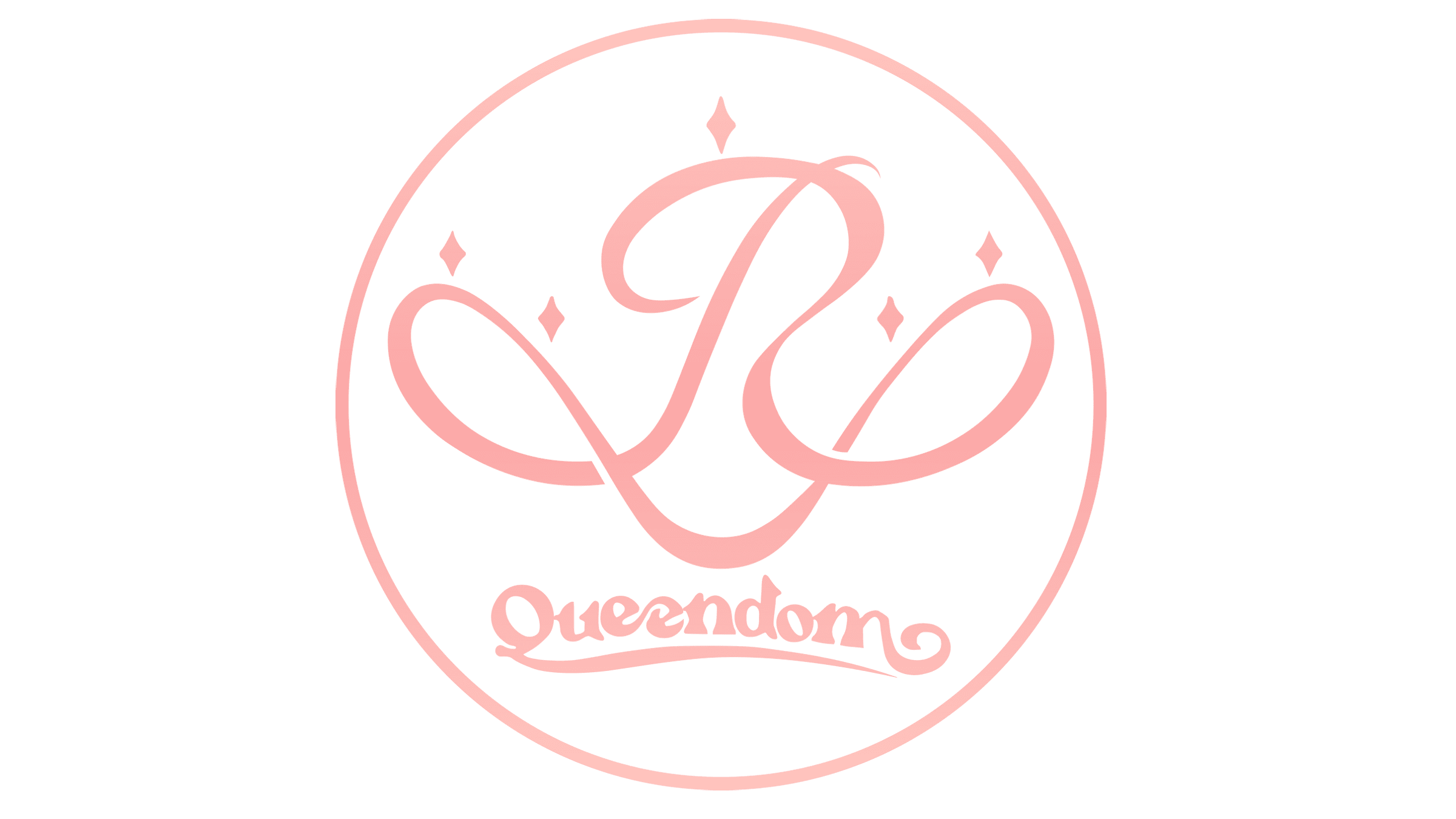
![]()
The release of the new album, named Queendom, was accompanied with a logotype, designed by the brand designers of the band. It was a bold name of the album, written in large letters, and bordered from the group’s name by a fat line. The name had a handwritten typeface. The whole image was pink.
2022
![]()
The 2022 work of the Red Velvet brand designers is the Feel My Rhythm watermark. The large album’s name was located below the small group’s name. There was no any background or other elements.
Font
In the 2022 logotype, there are two fonts. At the top of the logo, they placed the very small ‘The ReVe Festival 2022’ caption, which has a typical serif typeface with small gaps between the letters. Below, we can see the highly decorated handwritten name of the group’s 2022 album – Feel My Rhytm.
Color
The girl band’s brand designers always used pink as the main coloring, but sometimes they changed the coloring to a more red style. In some logos, you can find red elements, while in other ones they drew pink elements. In their corporate color palette, however, you can also find black, blue, white and yellow shades.


