Bob the Builder is a British animation show for kids, which was released in 1998 and tells about Bob, who helps to build and renovate different projects. The tv-show is extremely popular in not Great Britain and the USA.
Meaning and history
Being an animated tv-program, Bob the Builder features a bright and colorful visual identity. The Bob the Builder logo is composed of a rectangular with a wordmark on it.
The frame of the rectangular is deep blue with 6 cogs in it, which shows Bob’s profession. The main background color is also blue but in a lighter shade. And has a diagonal grid pattern.
The most important element of the TV-show’s visual identity is its wordmark. It is executed in a custom condensed font, with thick geometric lines and a thin red outline for the “Bob” part. Each of three letters consists of two parts, like in the kid’s building kit.
“The Builder” is written in a more traditional sans serif typeface and placed inside a red rectangle, where “The” is smaller and placed vertically.
The blue yellow and red color palette of the Bob the Builder logo evokes a happy and welcoming feeling. It is funny, it is bright and it is instantly recognizable and loved by kids across the globe.
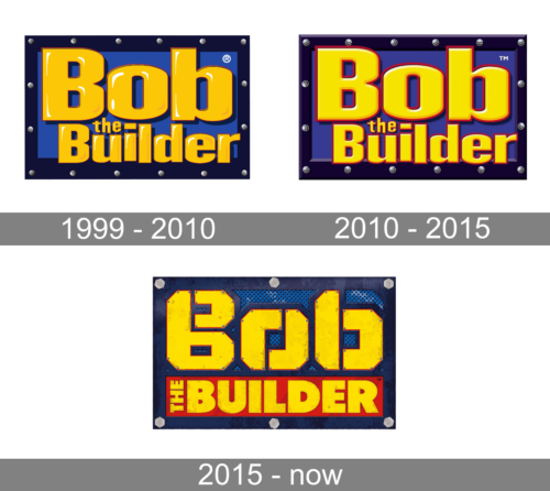
1999 – 2010
The first Bob the Builder logo, introduced in 1999, stayed with the animation for almost a decade and became a basis for all future redesigns. The rectangular blue banner in a navy-blue frame with grey screws around the perimeter boasted a bright yellow inscription set in a custom cartoonish typeface with heavy characters decorated by small white strokes, which created the volume of the letters and added a gloss-like image for the whole badge.
2010 – 2015
The redesign of 2010 has refined the color palette of the Bob the Builder badge, making all shades but the yellow deeper. The lettering got redrawn in a lighter shade of yellow with the white accents moved to contours, and the red outline of the characters getting thicker. This made the badge look stronger and brighter, and the characters of the inscription — were more geometric and brutal.
2015 – Today
In 2014 Bob the Builder logo was redesigned again, keeping the original composition and color palette, but changing the style of the lettering and adding a red narrow rectangular banner behind the bottom line of the inscription. The characters of“Bob” are now formed of two elements, placed at a small distance from each other. The yellow surface of the fragments is drawn with some grayish rust, with each element outlined in red and embedded with small gray screws around the perimeter.


