Bēhance is a social media platform dedicated to creative work. It boasted more than 10 million members in 2018. The brand belongs to Adobe.
Meaning and history
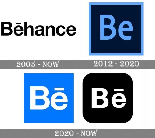
The two pillars of the brand visual brand identity are the primary Behance logo (which is essentially the wordmark) and the icon (which is essentially a shortened version of the wordmark).
While the wordmark has preserved its original look, the icon has gone through more than one update.
Primary logo (since 2005)
The company was established by Matias Corea and Scott Belsky in late 2005. The earliest recorded logo is the one you can see in the top left corner of the website today (as of late 2020). It has preserved both the black-and-white color scheme and the shape. This approach provides excellent recognizability for the brand.
The logo showcases the name of the website written in Helvetica Bold. This is an austere sans serif typeface providing perfect legibility. On the other hand, it is totally generic and has been used in thousands of logotypes. Thus, the use of Helvetica means that the logo doesn’t look very unique. The fact that there is no pictorial part in the logo only makes the matters worse.
The designers have partly resolved the problem by adding a diacritical mark to the “e”, the so-called macron, which is a straight bar above the letter.
The “no-logo” approach is emphasized by capitalization. Only the initial has been capitalized, while the other glyphs are lowercase as if the word is part of a simple text.
2012
In late 2012, the company was purchased by Adobe Systems. The new owners left the wordmark unchanged but introduced an additional icon.
Here, you can see the letters “Be” inside a box. The letters are bright blue as is the border of the box, while the filling is black. This results in a fancy “disco” effect.
Interestingly, the type was different from the one used on the primary Behance logo. Both the “B” and “E” were shorter and higher. The modification of the proportions let the designers make the icon more compact and squeeze the letter inside a square.
2020 (first version)
The emblem grew simpler and friendlier. The blue disappeared. The angles were rounded. The glyphs now were slightly wider and bolder. Again, it wasn’t the same type as on the main logo.
2020 (second version)
Here, the letters look very much like on the primary logo. Even the macron (the horizontal bar) is there. This fact establishes a closer connection between the icon and the full wordmark.
This time, however, the color of the box is blue, while the letters are white.
Font
Helvetica Bold, which is used in the primary Behance logo, belongs to the Helvetica family of fonts. Helvetica was created in 1957 by designer Max Miedinger with input from Eduard Hoffmann. It was published by the type foundry Linotype.
Colors
While the primary version has always relied on a simple black-and-white palette, the icon has experimented with various shades of blue.


