The ice hockey team Bakersfield Condors was created in Bakersfield, California, in 2015 out of two teams, the NHL Edmonton Oilers that relocated from Edmonton, Alberta, and a minor league ice hockey team Bakersfield Condors that played locally in 1998-2015.
Meaning and history
The Bakersfield Condors, a professional ice hockey team, were founded by Jonathan Fleisig in 1998. The team is based in Bakersfield, California, and plays in the American Hockey League (AHL) as an affiliate of the Edmonton Oilers of the National Hockey League (NHL). The Condors started as a West Coast Hockey League (WCHL) team before transitioning to the ECHL in 2003, following the WCHL’s merger with the ECHL. They continued in the ECHL until 2015, when they became an AHL team.
Throughout their history, the Bakersfield Condors have been known for their engaging promotions and community involvement, becoming a beloved part of the Bakersfield sports landscape. They have achieved notable success on the ice as well, particularly in recent years. One of their major achievements includes winning the ECHL’s Pacific Division in the 2013-2014 season. In the AHL, they have continued to build a competitive team, reaching the playoffs in multiple seasons and developing players who have gone on to succeed in the NHL.
As of now, the Bakersfield Condors continue to play a significant role in the AHL, focusing on developing young talent for the Edmonton Oilers while also aiming to achieve their own success in the league. The team has maintained a strong fan base and is an integral part of the local community, contributing to various charitable causes and maintaining a strong presence in Bakersfield’s sporting culture.
What is Bakersfield Condors?
Bakersfield Condors is an American professional ice hockey team affiliated with the Edmonton Oilers. Based in Bakersfield, California, they compete in the American Hockey League, focusing on developing young talent and contributing significantly to the local sports community.
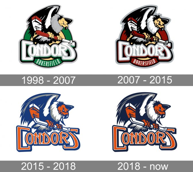
1998 — 2007
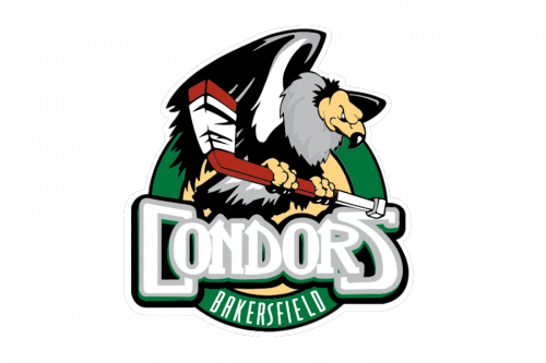
The first Condors logo was composed of a yellow circle in a thick green framing, with the white “Bakersfield” lettering set on its bottom part. The enlarged condor bird was set over the badge, holding a baseball bat and sitting on the bold stylized “Condors” inscription in white and gray.
2007 — 2015
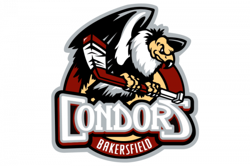
The redesign of 2007 refined and emboldened the contours of the Condors badge and switched the color palette from green to burgundy. In the new shades, the badge started looking more confident and even aggressive, reflecting the fighting spirit of the baseball club.
2015 — 2018
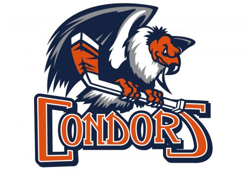
The Bakersfield Condors logo debuted on April 2, 2015. It fit the name of the team perfectly. A giant condor was holding a hockey stick in its paws, while below it the word “Condors” in orange capital letters with a white and blue outline could be seen. The logo was based on the emblem of the old Bakersfield Condors team.
2018 — Today
The redesign of 2007 refined and emboldened the contours of the Condors badge and switched the color palette from green to burgundy. In the new shades, the badge started looking more confident and even aggressive, reflecting the fighting spirit of the baseball club.
Colors
The emblem features four colors: dark blue, a comparatively noble shade of orange, dark gray, and white as a secondary color.


