Keinath is a German brand of the automaking company, which was established in the 1980s, and is specialized in the production of convertible and sport-cars.
Meaning and history
Keinath is one of those car companies that only true connoisseurs are familiar with. Da Pawnee, which started in the 1980s by turning Opel and Vauxhall sedans into convertibles, is now producing its own sports cars.
The first original Keinath model was introduced in 1997. It was Keinath GT/R, a luxury sports car, which was made in quantities of 21 copies with Opel engines of different capacities. There was also a version with a GM engine. And the model, which was created by Keinath from A to Z was released in 2001 — Keinath GT/C, a sports car in a coupe and convertible versions with a top speed of up to 250 km/h.
What is Keinath?
Keinath is the name of a small German automobile marque, which was established in 1983, and by today has turned into an atelier, specializing in the production of sports cars. The company has a very good reputation among car altruists and connoisseurs from all over the globe.
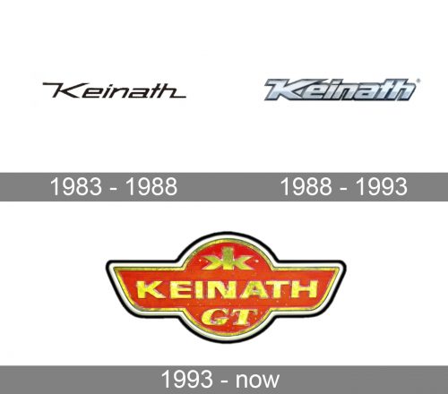
1983 – 1988

The initial Keinath badge was introduced in 1983. It was the most stylish and minimalist logotype of all, created for the automaker throughout its history. The first insignia featured simple black lettering on a plain white background. The lettering was set in a title case, and used a slightly italicized custom Sans-serif typeface with square futuristic shapes and the elongated lines of the first letter “K” and the last “H”.
1988 – 1993

The redesign of 1988 kept the recognizable contours of the Keinath badges but made the letters thick and three-dimensional, drawing them in gradient silver and outlining each symbol in black. The letters got wider and less space was used between them, thus the new badge was heavier yet more solid and stable than the previous version.
1993 – Today
The Keinath visual identity is one of the examples of the timeless classic, with very traditional shapes and color scheme chosen. It is composed of a laconic yet chic badge with a lettering and a small geometric symbol on it.
The scarlet-red emblem of the automaker has a shape of a circle overlapping an elongated horizontally placed rectangle with its sides cut diagonally, resembling two wings.
The badge had a double outline — thick gold inside a thin black one — and golden lettering. The main, “Keinath”, wordmark in all capitals was written in a strict and clean bold sans-serif typeface, while the bottom line, “GT”, was executed in an italicized serif font.
Another detail of the Keinath logo was a small abstract symbol, placed on the upper part of the emblem. It was something looking like the Russian letter “Ж”, simply composed of two mirrored “K” in the lower case.
The red, gold, and black color palette of the brand’s logo was a representation of a luxury segment and professional approach to the design and production of the company’s cars. Red also symbolizes passion and power, when gold ads elegance and sleekness to the overall picture. Think black accents point to the authority and expertise of the company.
Font and Color
The bold handwritten logotype from the Keinath logo is set in a custom sans-serif typeface with geometric stable letters executed in thick straight bars with clean contours and traditional cuts of the lines. The closest font to the one, used in the Keinath insignia, is, probably, Presta Extended, but with some modifications of the contours.
As for the color palette of the Keinath visual identity, it is based on a combination of red and gold, which looks very bright and even flamboyant, evoking a sense of deep confidence and progressiveness, and showing the company as a brave and powerful one.


