Babolat is one of the oldest sports companies producing big tennis equipment. It was founded back in early 1875 in Lyon, France. The creator was Pierre Babolat, who in the same year produced and patented his first tennis strings. Today Babolat is one of the leading companies producing tennis equipment. Along with rackets, the brand also produces clothes for tennis players. And tennis shoes from Babolat are characterized by super lightness and extreme durability.
Meaning and history
When we talk about the world leaders in tennis products, one of the first names that comes to mind is the Babolat brand. With a history of over a hundred years, this company has become synonymous with quality and innovation in the world of tennis.
The activity of the world-famous company Babolat began in 1875 in France. Then Pierre Babolat managed to patent and produce tennis strings. The strings were produced from natural material – the top layer of bovine intestines – in factories located in the western part of France. At that time, tennis was just beginning to gain popularity in France, and the demand for quality tennis rackets and strings was enormous.
In 1925, the brand introduced the VS string, which provided the racket with long-lasting elasticity and durability. This type of string was developed based on the recommendations of the then-leading French tennis players Jean Borotraux, Henri Cochet, Jacques Brunion, and René Lacoste, nicknamed “The Musketeers”. Already in 1927, the Musketeers combined to win 20 Grand Slam titles and 6 Davis Cup titles. The VS string also brought success to the first female tennis player, Suzanne Lenglen.
Given the demand for equipment, in 1950 an international network of distribution companies was opened, which was decided to be named Babolat in honor of its creator.
Since 1955, Elascord synthetic strings have been in production. This significantly reduced the purchase price of the products, and their wear resistance increased many times over.
1975 the company was able to patent one of the world’s very first specialized electronic string tensioning machines.
By 1994, the company’s strings had gained worldwide popularity, and its founder insisted on producing a line of tennis rackets. The first model was the Pure Drive, which later became legendary. It looked like the absolute opposite of the professional models of the time, so at first, it was perceived as amateur. The weight of the invention was only 300 g.
In 2001, the company began to actively use nanocarbon in its production. In the same year, the brand’s assortment was replenished with branded tennis balls. In 2003, in collaboration with Michelin, Babolat released the first collection of its sports shoes and clothing.
Year after year, new materials are introduced and new research is carried out. In 2006, Babolat racquets were redesigned to reduce vibration properties, and cooperation with other companies was developed.
The year 2012 was marked by the release of the first plug-in racket Babolat Play. The gimmick is characterized by the fact that a special sensor built into the racket can accumulate data about the game: speed, intensity of strokes, and degree of rotation. A little later, the Babolat company logo is slightly modified.
Babolat has been the official sponsor of the French Open, the second Grand Slam tennis tournament, since 2011. Since 2013, the brand has been the official shoe brand of the Wimbledon tournament for 5 years.
What is Babolat?
Babolat is the name of the world’s oldest company producing tennis equipment, particularly racquet strings. The brand was founded in France in 1875. Today this brand name produces all the necessary equipment not only for tennis and its varieties but also for badminton.
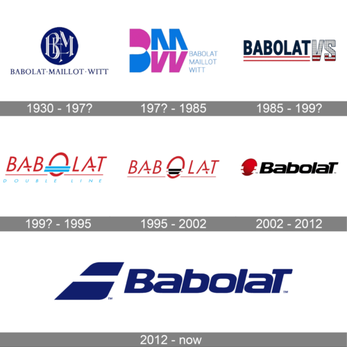
In terms of visual identity, like any other brand with more than 100 years of history, Babolat has had a lot of changes and experiments. The first badges were designed back when the company’s name was Babolat Maillot Witt, and only in the beginning of the 1990s, the “Babolat” wordmark was left the only one.
1930 – 197?
The original Babolat logo, introduced in the 1930s, featured a fine blue and white emblem with the stylized BM monogram in a solid blue roundel. The emblem was accompanied by elegant uppercase lettering with the full name of the company, written in a classy serif typeface.
197? – 1985
In the 1970s the Babolat Maillot Witt logo was completely rethought, with modern massive shapes replacing the old-style elegance. The color palette was switched to blue and pink, the serif font — to geometric lightweight sans-serif, and the sophisticated roundel was replaced by an abstract BMW monogram, where the “B” was enlarged and the “M” and “W” were set on its right, and placed under each other.
1985 – 199?
The logo in question represents the Babolat brand, prominently featuring the word “BABOLAT” in bold, uppercase letters with a classic serif font that conveys tradition and professionalism. The serifs on the letters are subtle, complementing the overall sturdy and reliable feel of the design. Accompanying the brand name is the abbreviation “VS,” depicted in a distinct, squared-off font that contrasts with the main typography. The “VS” is encased in a checkered pattern with a red outline, reminiscent of a tennis net, symbolizing the brand’s strong association with tennis equipment. Below the brand name runs a dual-striped line in red, reinforcing the sporting theme. This logo design was adopted by Babolat in 1985, suggesting a long-standing heritage in sports.
199? – 1995
The first logo without “Maillot” and “Witt” was set in a completely different style. The slanted uppercase “Babolat” wordmark was written in a stylized sharp sans-serif font, in red characters, with the “O” enlarged. The “O” was crossed by two thick horizontal blue lines, which became the symbol of the brand and a synonym for high quality. The blue lines were balanced by the blue “Double Line” tagline.
1995 – 2002
The redesign of 1995 removed the tagline from the primary Babolat badge and switched the color palette of the logo. Now the red wordmark was outlined in white and placed on a solid black background, making up a dramatic composition. As for the blue lines, crossing the bottom of the “O”, they turned gray in the negative space, and white when overlapping the red contour of the letter. This logo stayed with the brand for almost seven years.
2002 – 2012
In 2002, a very modern Babolat badge, which was still set in the same black, red, and white color palette was introduced. Now the emblem was set on the right from the bold softened lettering with the title case characters slightly slanted to the right. The graphical element was the same “O”-shaped rocket head, but this time it was set in gradient red, and had short white strokes on the sides, reminding of the famous double line.
2012 – Today
The redesign of 2012 has slightly modified the bold sans-serif font of the previous logotype, switched the color palette to solid blue, and completely redrew the emblem. The roundel was gone, and now the Babolat emblem featured two bold lines placed one above the other and forming the shape of the plane tail. It is a representation of speed and confidence, which you can also see on each rocket, produced by the brand.
Font and color
The bold and smooth lettering from the primary Babolat logo is set in a sleek modern sans-serif typeface with the title case characters placed pretty close to each other. The main peculiarities of this lettering are the capitalized “B” and “T”, and the softened contours of the heavy masculine shapes of the letters.
As for the color palette of the Babolat visual identity, here we have two options — solid dark blue, which looks chic and evokes a sense of excellence, or a combination of black and light blue, which looks more energetic and fresh.


