

![]() Bostik Logo PNG
Bostik Logo PNG
Bostik is the name of adhesives and sealants manufacturing company, which was established in 1889 in the United States. Today the company headquarters in France and is a part of the Arkema Group. The label operates worldwide and has more than 5 thousand employees across the globe.
Meaning and history
![]()
Bostik was founded in 1889 and has since become one of the best-known international brands in adhesive solutions. The company has continuously evolved and adapted to changing market requirements and customer needs. Today Bostik is part of the Arkema Group, a global leader in specialty chemicals.
The company manufactures and markets its products in three main areas: industrial, construction, and consumer. For more than a century Bostik has been developing innovative bonding technologies that are used in a wide range of applications, from shipbuilding and building construction to furniture and packaging.
Today the company is represented on 5 continents in 46 countries, employs 4500 people worldwide, and owns 55 factories. Bostik products are used in shipbuilding, construction, furniture, and packaging applications.
The range of offered mixes, adhesives, and sealants is constantly updated, and new technological formulas appear, significantly improving the work with the materials. Bostik products adhere to almost all types of surfaces (including dissimilar ones), guaranteeing a strong bond for a long period.
Before 2000
![]()
The original logo of Bostik was based on a simple extra-bold title case inscription in a classy serif font, with the solid blue letters set on a plain white background with no additional elements.
2000 – 2004
![]()
The redesign of 2000 has completely changed the style of the Bostik logo, rewriting the name of the company in the uppercase of a geometric sans-serif font, in one line, on the right from the minimalistic emblem, which depicted a heavy red “A”, written as a triangle with an open contour, enclosed into a blue triangular frame, formed by three corners.
2004 – 2013
![]()
In 2004 the badge was redesigned again, with the name of the company rewritten in an italicized font with interesting contours of the first and the last letters. The smooth blue inscription was placed against a white background and enclosed into a red oval frame with the contour open at the left.
2013 – 2021
![]()
The redesign of 2013 has introduced a new logo for Bostik. It was a heavy deep-blue title-case inscription in a modern sans-serif font, with the “S” and “T”. Connected. The lettering was accompanied by a green and orange image of a lizard, placed in the bottom left corner of the composition.
2021 – Today
![]()
The Bostik visual identity is lively and colorful. Containing a very detailed image of the company mascot, the brand’s logo is fresh and crispy, composed of a wordmark and an emblem.
The label’s emblem is a green three-dimensional gecko with orange sports, executed with huge attention to details like it is alive and will start moving while you look at it. The company chose a gecko as a symbol due to its adhesive properties — as this creature can cling to any surface.
Gecko is also known to be a symbol of rebirth and energy, which are also important qualities for any business — the ability to grow and develop whatever happens. The company’s mascot also reflects such qualities as efficiency and adaptability, which perfectly suit the Bostik products.
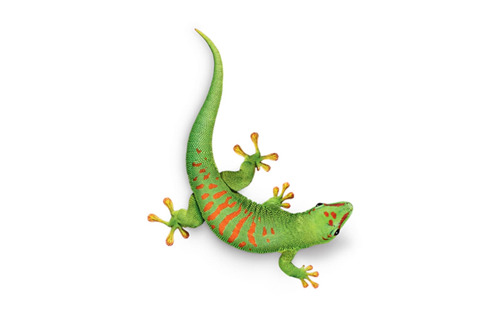
The green and blue color palette of the corporate logo represents a strong and powerful company, with its creative and innovative approach to manufacturing and distribution. The deep blue of the wordmark shows the company as stable and confident, while the green lively emblem adds a sense of energy and inspires.
Font
The company’s wordmark is executed in a modern and sleek sans-serif typeface, which is very close to Cabrito Sans Ext Extra Bold, but with its angles sharpened and its letters’ cuts more distinct. One more modified element of the typeface is the connecting horizontal bar of the letters “S” and “T”, which also represents the company’s essence — adhesive materials production.
The label’s nameplate is complemented by a delicate tagline “Smart adhesives” in the lowercase, which is written in a more traditional font, similar to Pluto Sans Medium. It balances the logo and adds seriousness and authority.
![]()
Review
Bostik is a company with a very rich history. It was established in 1889 in the United States as a footwear industry supplier, which started expanding globally in the 1920s. In the middle of the twentieth century, the company became famous as one of the world’s leaders in the chemical industry.
The company was acquired by the French gas corporation, Total Group, which opened the new markets. In 2015 the brand got a new owner — Arkema, which started it’s new are its development.
Today the company has its operational offices in almost 50 countries across the globe, where 5 thousand of the Bostik employees work. The company’s innovative approach and a wide research policy help in performing revolutionary formulas and new products almost every year.


