Mattel is the name of a toy manufacturing company, which was established in 1945 in the United States. The company, named after its two founders, owns several toy brands and is considered to be one of the world’s leaders of its segment.
Meaning and history
The founders of Mattel are Elliot Handler and his friend Harold Mattson. Mattel is based on the initial letters of the surnames of the founding fathers — it is shortened to Matt and El. Initially, the company was engaged in the production of picture and photo frames made of wood and plastic.
Because of health problems, Mattson sold his share to Handler, and Elliott’s main partner became his wife Ruth. One day Ruth noticed that after the production of frames left a lot of unused wood, which was simply disposed of, she suggested to her husband to make furniture for dolls from the remnants. In the first year, the company made more than30 thousand USD from toy furniture sales, which far exceeded the firm’s income from the sale of wooden frames.
Already in 1946, the company switched completely to the production of toy furniture, expanded the range, and began to make clothing and cosmetics for dolls. And the following year the first plastic toy was created – a miniature Hawaiian guitar Uke-A-Doodle.
Since then, the company became a leader in the manufacture of toys, first in his country and then around the world, and so it continues to this day. Today Mattel products are sold in more than 150 countries around the world, and for all their existence has won the trust and love of customers from all over the globe.
What is Mattel?
Mattel is the name of the largest American company for the production of toys and scale models of machinery. Founded in 1945, today Mattel not only produces toys under its label but also owns several smaller brands from different countries, specializing in different styles and themes.
1945 – 1955
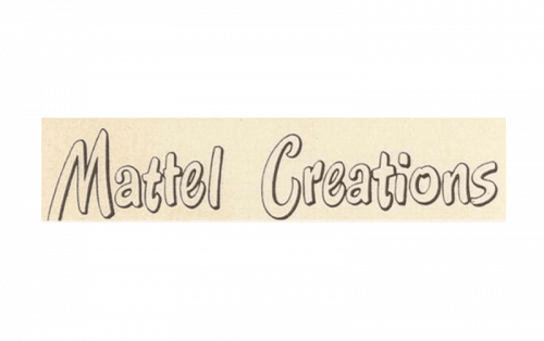
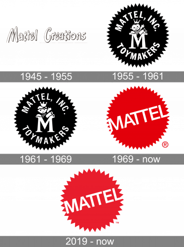
The original Mattel logo was created in 1945 and had nothing in common with the bold and bright badges we are used to seeing now. It was a delicate and tender stylized rounded inscription placed on a light cream background. The letters featured the same color as the badge itself and a thin black outline, which got a bit thicker on the inner parts of the letters capitalized creating an illusion of a shadow and adding some volume to the wordmark.
1955 – 1961
The following emblem looks like a black round label with many small tips dispensed along the edge. Inside, there is the company’s contemporary name, written in white, capital letters (‘Mattel Inc. Toymakers’). Plus, they’ve put an image of a boy in the very middle. This boy is wearing a crown and sitting on top of a big letter ‘M’.
1961 – 1969
 The gray and white color palette of the original Mattel logo was a reflection of the traditional approach and value of quality. It was a delicate and timeless logo, which is very precious to the company.
1969 – Today
The redesign of 1969 brought a new red and white color palette to the Mattel visual identity. The black star-seal turned scarlet red and the only element placed on it was now a diagonally oriented white “Mattel” inscription in the uppercase, executed in a bold and strict geometric sans-serif typeface.
2019 – Today
The 2019 logo is based on the shape of the original one. Though the color palette was dramatically changed. The scarlet red circle with the diagonally placed white wordmark is now the symbol of a famous toy brand.
The Mattel inscription in all capitals is executed in a strict sans-serif typeface. Its white letters are perfectly balanced in terms of size and spaces and the diagonal placement of the wordmark adds playfulness and energy to the emblem.
The bright and full of energy Mattel logo represents a powerful company, which values its legacy and history. It is a timeless example of a visual identity design — bold, brave, yet minimalist.
Font and Color
The simple geometric lettering from the primary Mattel badge is set in the uppercase of a modern sans-serif typeface with clean contours of the characters and medium-weight bars. The closest font to the one, used in this insignia, is, probably, Rolphie 07 Heavy SC, or Helvetica Now Display Bold.
As for the color palette of the Mattel visual identity it is composed of red and white, two contrasting colors, which create an eye-catching image and represent a very confident and professional company, at the same timeevoking a sense of energy and passion.


