

![]() Amtrak Logo PNG
Amtrak Logo PNG
The highlight of the Amtrak logo is the rail design formed by the negative space. It creates a symbolic connection with the passenger railroad service, in which the company specializes.
Brand Overview
Amtrak is the brand under which the National Railroad Passenger Corporation operates. The company offers medium and long-distance intercity service in the contiguous US and to around ten cities in Canada. The number of destinations reaches 500, while the number of trains operated daily reaches 300.
It was established in 1971 as a quasi-public corporation. While the corporation gets several state and federal subsidies, it is operated as a for-profit organization. The brand is headquartered in Washington, D.C.
Meaning and history
![]()
Amtrak is a railroad company whose trains connect almost all major U.S. cities. Amtrak carries tens of millions of passengers annually between almost all U.S. states. The name Amtrak is derived from the two words, “America” and “Track”.
Trains travel long distances, so they have all the appropriate amenities. Amtrak uses different types of trains depending on the route chosen. There are trains with sleeping compartments, a restaurant, and even an area for carrying cars, but on many routes, trains run more standard. In addition, Wi-Fi is often available, and many trains have a restaurant or bar where you can have coffee or even dinner.
What is Amtrak?
Amtrak is the name of an intercity railroad operator in the United States, which was founded on May 1, 1971. For more than fifty years, Amtrak has provided high-quality rail passenger service, one of the most reliable operators in the country. The company offers more than 40 different routes around the country, the longest of which covers 3,924 kilometers.
1971 – 2000
![]()
The earliest logo was nicknamed The Arrow (motion-mark or chevron). The simple and dynamic emblem represented “speed and purpose of direction,” claimed the official Livery and Logo Guide published in August 2018.
The symbol was formed by three shapes: a red head of an arrow and two symmetrical blue boomerangs. The name of the brand could be placed either above or to the left of the emblem.
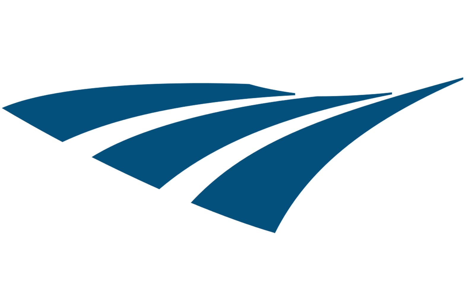
2000 – Today
![]()
The so-called Travelmark is even more dynamic than its predecessor. The effect of implied motion has been created with the help of abstract lines ad negative space imitating two rails curving towards the horizon.
Above the symbol, the name of the company can be seen. This time, it features an all-caps sans and is given in the same shade of blue as the pictorial part of the emblem. Also, there is a version where the wordmark is larger in comparison with the rail symbol and is placed to the right.
Acela emblem
The high-speed service Acela Express was introduced in late 2000. While it has an independent logo, you can notice it has been inspired by the company’s primary logo. You can notice it in the way the emblem is made up of separate elongated shapes.
According to the official brand guidelines, the emblem represents a sea turtle’s fin “instilling stately and peaceful progress through the blue water.”
In comparison with the primary Amtrak logo, this one looks more streamlined. The rounded shape of the “fin” and the glyphs suggest faster motion than the logo of the parent brand, which is already quite dynamic. Also, the Acela logo is lighter and has more depth due to the gradient. It can be used without the gradient, in a darker shade of blue, though.
Colors
The Arrow logo combined red, blue, and white with black. The palette was inspired by the National Flag of the US, although the shades were not the same. The current version can be either dark blue or black on the white background.
Font
The old arrow logo featured a customized version of the Helvetica typeface. This is a straightforward, minimalist sans serif type that has been used in hundreds of logotypes. In the current version, a broader sans serif type is used. This time, all the glyphs are capitalized.


