Autobianchi, an Italian automobile manufacturer, is known for producing compact and stylish vehicles. Founded in 1955, the company was jointly owned by Fiat, Pirelli, and Bianchi. Autobianchi focused on manufacturing small cars, including popular models like the Bianchina and A112. The company’s production facilities were located in Desio, Italy, where skilled engineers and technicians worked diligently to craft high-quality automobiles. Autobianchi’s dedication to design and innovation made it a significant player in the automotive industry, and its cars were well-received by customers around the world.
Meaning and history
Autobianchi is an Italian automobile manufacturer founded by Edoardo Bianchi in 1955. The company quickly gained recognition for its innovative designs and advanced engineering. One of Autobianchi’s notable achievements was the release of the Bianchina model in the late 1950s, which became immensely popular and contributed to the company’s success. In the 1960s, Autobianchi introduced the Primula, the first car with a transverse engine and front-wheel drive in its class. This groundbreaking design set a new standard in the automotive industry.
In the 1970s, Autobianchi became part of the Fiat Group, leading to the development of several collaborative projects. The company’s collaboration with Lancia and Abarth resulted in the production of the Autobianchi A112 Abarth, a small, sporty car that garnered praise for its performance and handling.
Despite its past successes, Autobianchi faced challenges in the 1980s, and production of new models gradually ceased. Today, Autobianchi remains a part of automotive history, appreciated for its contributions to technological advancements and design innovations. While the company is no longer producing vehicles, its legacy lives on, and Autobianchi models can still be found in the hands of collectors and enthusiasts who cherish the brand’s unique heritage.
What is Autobianchi?
Autobianchi was an Italian automobile manufacturer known for producing small, stylish cars. Founded in 1955, it was a joint venture between Bianchi, Pirelli, and Fiat. The brand ceased production in 1995, but its legacy lives on through its iconic models like the Autobianchi A112 and Y10.
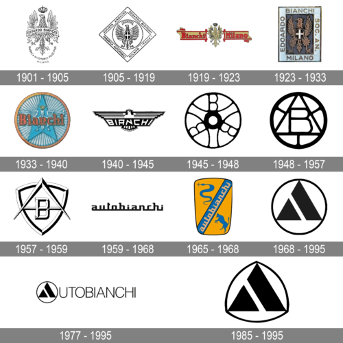
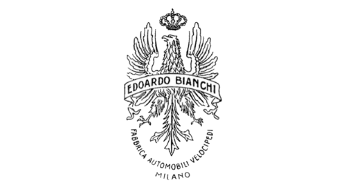
1901 – 1905
A grand, detailed drawing of an eagle served as the base for this logo. To create an even more majestic look, the designers added a crown above the eagle’s head. The founder’s name was printed on a banner that ran across the eagle’s body using a simple sans-serif font. At the bottom, the logo had an inscription curving around the eagle’s tail. It said “Fabrica Automobili Velocipedi” with “Milano” added as the second line. The logo looks quite luxurious and reflects the company’s goal to be a leader in the industry.
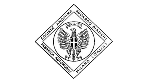
1905 – 1919
The eagle is still the center of the logo. It is now placed in a circle that had a square framing placed on a diagonal. The framing had multiple inscriptions. In the upper right corner, it had the name of the founder, while in the lower corner, the framing had the location of the company. It also specified what the company was doing. A banner with the founder’s last name replaced the crown above the eagle’s head. He surely deserved to take this meaningful position in the company’s logo.
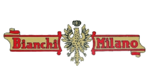
1919 – 1923
The company’s logo looks bolder thanks to a new color palette – red, golden, and a bit of black. The eagle with a crown was placed in the center with a banner on either side of it. On the left, the banner honored the last name of the founder. To the right, it specified the location of the company – Milano. Although the logo looked quite busy, there was something royal about it.
1923 – 1933
The company preserved its iconic eagle icon, giving it more detail and making it look more realistic. It now had a dark rectangular background with a wide, light border that had the founder’s name “Edoardo Bianchi” and the location “Milano”. It appeared that the eagle and the inscriptions were stitched using a golden thread.
1933 – 1940
The founder’s name took the key position in this logo. It was printed in golden with an orange hue, just like a border around the round emblem. The lettering had an outline that gave it some volume and allowed it to better stand out against a rather busy background. The latter had a blue arrow pointing upwards with rays coming out of it in a circular pattern. The almighty eagle with a golden crown spread its wings behind the name. The emblem reminded of a medal, a well-deserved award for the Bianchi brand.
1940 – 1945
The logo still features an eagle along with the brand name. The logo is done in black and white with bold lines that created an image of a solid, well-established brand. The wings were formed from four, white horizontal lines. Under these lines, the wings had a wide black line with the brand’s name printed in white, uppercase letters. For the typeface, they chose a very funky, asymmetrical font, so the letters filled the whole shape.
1945 – 1948
The new logo looks like a wheel with an interesting pattern inside the ring. The wheel is a perfect emblem for a company that deals with automobiles. The emblem also has three hidden “B”s, which stand for the founder’s and brand’s name.
1948 – 1957
The emblem of the company was redesigned. Here, the logo features only one “B”. It is placed in the center and has a triangular framing. The new design does not resemble a wheel anymore, but rather a round emblem with the brand’s initial being the key figure.
1957 – 1959
The brand’s emblem now has a shield shape and all the elements appear to have a three-dimensional appearance. The “B” initial was placed in the center across the horizontal bar of a large “A”, Standing for AutoBianchi. It is simple, yet bold and speaks about the authority of the company.
1959 – 1968
For the first time, the logo featured only the name of the company. It was printed using a formal, powerful color back. The designer used a sans-serif, geometric font, and all lowercase letters. All the characters were interconnected by a horizontal line at the bottom, creating an image of a solid company.
1965 – 1968
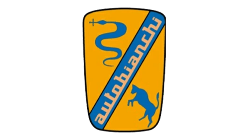
This logo introduces new brand symbols – silhouettes of a snake and a jumping bull. They were placed in opposite corners across a horizontal banner running through a rounded rectangular base. The banner was done in blue and had the company name running across it and featuring the same writing style as in the previous logo. The yellow in the emblem gave the logo an energetic feel, while the silhouettes reflected the strength, growth, and new beginnings of the brand.
1968 – 1995
The company has already used a round emblem for over ten years. That logo resembles a simplified version of the 1948 emblem with a round border and a triangle in the center. The triangle is almost completely black having only one diagonal white line running through and creating an illusion of a smaller triangle and a diagonal line. The triangle symbolized the first letter of the company’s name – AutoBianchi.
1977 – 1995
The previous emblem was also used with a full name. The triangle replaced the “A” in the AutoBianchi. The rest of the characters featured thin, elegant lines that matched the thickness of the round border. All the letters were uppercase and closely spaced. The logo looks sophisticated and timeless.
1985 – 1995
In 1985, the company brought back the logo it introduced in 1968. It replaced the round border with a rounded triangular one, keeping the triangle in the center unchanged.


