Ask is a service, which was created to answer questions. The platform was launched in 1996 in the United States. Today the software has over 100 million users across the globe and has also released a mobile application.
Meaning and history
Ask.com was established in California in 1996, by two friends, David Gruener and David Warthen. Initially, the platform was thought to be the question answering portal, where any user could ask whatever he is interested in and get a complete response. At its core, Ask was created as a search engine, but today the platform has grown into a large reputable news and informational website, covering all the spheres of life and society, from politics to culture.
What is Ask?
Ask is an online platform, which was designed in the middle of the 1990s as a website, where you can ask questions and get all the answers. In time, the platform has grown into a large informational portal, with news and articles on various topics. Although, you still can type in a question of your interest and get a response.
1996 – 1999
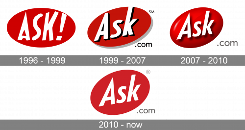
The original Ask logo already looked pretty much like the current one. There was the white word “ASK” set in a sans serif type and there was a red ellipse in the background.
However, unlike the current logo, the letters were capitalized and there was a quotation mark. The letters were positioned horizontally, and their shape was more casual.
1999 – 2007
Both the lettering and the ellipse were rotated counterclockwise. The word “.com” appeared. Also, dark shades were now used, which gave some depth.
2007 – 2010
There was even more depth due to the addition of the gradient to the red ellipse.
2010 – Today
The Ask visual identity is minimalist yet bright and striking. The sharp wordmark, placed inside a bright oval is memorable and recognizable.
The Ask nameplate is executed in a sans-serif typeface with distinct straight lines and sharp angles. The slightly elongated and pointed peak of the letter “A” represents dynamics and progress.
The white and red color palette of the Ask logo is a reflection of strength and energy, it shows the software as a professional and reliable one, with values of progress, innovations, and research.
The oval shape of the Ask emblem symbolizes balance and harmony, creating a sense of loyalty and trustworthiness.
The Ask logo is bright and modern, its simple shapes and laconic design make it timeless. Everything is balanced and neat here, it’s refined lines and a traditional color palette.
Font and color
The bold white diagonally located lettering from the primary badge of the Ask platform is set in a geometric sans-serif typeface with the narrowed characters and softened angles of the bars. The closest fonts to the one, used in the Ask insignia are, probably, Brandon Text Condensed Bold and Balgin Bold Condensed.
As for the color palette of the Ask visual identity, it is set in black and red, with a light addition of gray. The scheme stands for passion and energy, showing the company as a progressive and constantly moving one. This combination also symbolized excellence and professionalism.


