The Asian Cup is the main competition among Asian national teams. It is held every four years one year after the World Cup. The history of the Asian Cup spans more than half a century, with the first tournament held in Hong Kong in 1956.
Meaning and history
24 teams are participating in the tournament. From 1956 to 1968 there was only a group stage, now the formula consists of group matches and a playoff series. Several teams from Oceania, including Australia, were included in the 1989 edition.
But Israel and Kazakhstan left the Asian federation after a while, moving to the European one. The New Zealand national team did the same, leaving to join the Oceania federation. The first cup tournament was held in 1956 in Hong Kong. But only the final round was held there. It included the winners of three zones. The Central Zone was represented by South Vietnam, the Western Zone was represented by Israel, and South Korea was announced from the Eastern Zone. The fourth participating team was the Hong Kong national team as hosts.
The most titled participant in the competition is the national team of Japan. This team has taken the main prize four times (the last time – in 2011). Iran and Saudi Arabia have three wins each, but all took place in the last century. In 2015, for the first time, the Australians prevailed at the Cup, and four years later, in the United Arab Emirates, Qatar unexpectedly won the Cup. In the deciding match, the Qataris defeated the Japanese 3-1.
The quantitative composition and, at the same time, the format of the tournament has changed several times. Since the first draws, the circle of contenders for the trophy has been systematically expanding until in 2019 it reached a record 24 teams. The same number of teams will compete for the title of the strongest in the region in 2024 in Qatar.
What is the Asian Cup?
Asian Cup is the name of a prestigious soccer competition, one of the most anticipated events in the world of sports. This competition, organized by the Asian Football Confederation (AFC), offers a chance for teams from the region to showcase their skills and compete on the world stage.
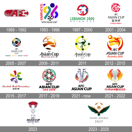
In terms of visual identity, the Asian Cup is very diverse, yet each of its logos looks bright and sleek. The emblem of the championship is changed once in four years, with the name of the hosting country inscribed into the design.
1989 – 1992
This logo appears to depict a simplistic design with the letters “AFC” prominently displayed in large, bold font, suggesting the importance of the event within the Asian Football Confederation. The stylized design of the letters incorporates a silhouette of a football, adding a clear indication of the sports nature of the event. The color scheme and design are straightforward, focusing on the initials and the sporting element.
1993 – 1996
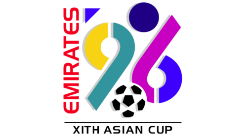
The Asian Cup logo from 1996 featured a stylized “96” in multicolor ribbons, a classic black-and-white football at the bottom, and a solid blue circle in the size of the ball, set on top of the composition. The name of the hosting country, “Emirates” was written vertically on the left of the emblem, in bold red capitals of a modern sans-serif typeface. The badge was underlined by the black all-caps “XIth Asian Cup” inscription.
1997 – 2000
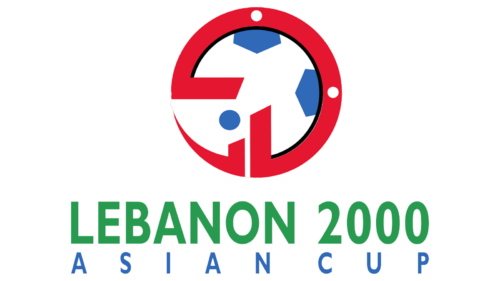
For the season of 2020, the Asian Cup logo was redesigned in a flatter and more minimalistic style. It was a white and blue football in a stylized red outline, with the two-leveled lettering under it. The inscription was set in a traditional sans-serif typeface, with the green enlarged and emboldened “Lebanon 2000” and the blue “Asian Cup” in small narrowed capitals.
2001 – 2004
In 2004 the Asian Cup was held in China, and the logo was executed in a design, celebrating Chinese culture. The roundel on the top of the composition was made of red dragons with ornaments, flying around a red and white football. The emblem was accompanied by an inscription with the “AFC Asian Cup” in the uppercase of a stylized font set in black, the Chinese name of the tournament also in black, and the small red “China 2004”, in a font, based on the Chinese hieroglyphs contours.
2005 – 2007
The 2007 edition of the Asian Cup logo featured a brush-drawn football with black segments alternating the white ones, with ornaments in different colors — yellow (for Malaysia), green (for Indonesia), blue (for Thailand), and red (for Vietnam). The emblem was underlined by the name of the championship in black capitals, and a tagline with the names of the hosting countries, each in its color.
2009 – 2011
In 2011 the Asian Cup took place in Qatar. The main element of any logo, the football, was redrawn in a gradient orange flame-like color palette, with the stylized image of the national symbol of the country, the Arabian oryx, inscribed into it. The emblem was accompanied by sleek black lettering with the burgundy “Qatar” tagline in small capitals.
2011
This logo features a kangaroo, an animal emblematic of Australia, leaping across a stylized representation of the Australian continent. The kangaroo is set against a backdrop of a yellow circle with green stars, colors and symbols that are strongly associated with Australia’s national identity. Below the emblem is the text “AFC Asian Cup” along with “Australia 2015”, set in a formal serif typeface that provides a stark contrast to the playful image above.
2012 – 2015
For the Asian Cup of 2015, held in Australia, the logo was redesigned again. The new stylized football was executed in a red and yellow color palette, with the abstract image of a football player on a yellow background. The graphical part was placed above the black and red lettering with the name of the tournament and the hosting country.
2015 – 2017
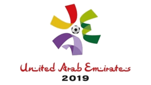
This logo for the event held in the United Arab Emirates consists of a colorful, abstract design featuring elements resembling petals or sails. A football is centered among the colorful shapes, symbolizing the tournament’s focus. The playful use of colors and shapes conveys a sense of celebration and international unity.
2017 – 2019
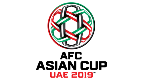
In 2019 the Asian Cup took place in the United Arab Emirates, and the logo of the competition was redrawn in the colors of the country’s national flag — black, green, red, and white. The football was made of the intertwined ribbons in different colors of the scheme, and underlined by a bold three-leveled lettering in black and red.
2021 – Today
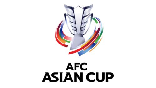
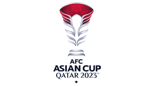
For the Asian Cup 2024, in Qatar, the logo was designed already in 2021, and this is the first time when the Cup’s badge is not based on the image of a football. The main element here is the trophy of the championship, the glossy silver cup, depicted in a schematic style, with silver and red gradients. The cup is accompanied by a stylized and bold lettering in black.
2021 – 2022
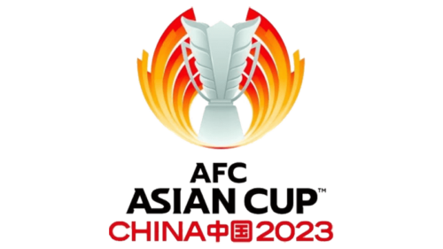
This design incorporates a stylized image that evokes the feeling of a trophy or flame, using red and gold gradients to convey a sense of excitement and celebration. These colors are often associated with energy, passion, and prosperity. The text “AFC ASIAN CUP” is prominent, with “CHINA中国2023” below, indicating China as the host nation for the event. The logo’s fluid shapes suggest motion and competition, the central themes of the tournament.
2023
This logo opts for a more minimalist approach, focusing on a sleek, gem-like representation of a trophy in deep red, with silver accents that give it a prestigious and modern feel. The text “AFC ASIAN CUP QATAR 2023” is clear and understated, using a simple and modern font to maintain focus on the emblem above.
2023 – 2025
The logo, intended for future competitions hosted by Saudi Arabia, displays a combination of a soccer ball and elements that may symbolize local architecture or art, using colors that could represent the nation’s flag. The design is symmetrical and balanced, indicating stability and order, and the text “Saudi Arabia 2027” suggests a forward-looking perspective for the event.
Font and color
The lettering from the Asian Cup logo, introduced in 2021, is set in a fancy yet stable sans-serif typeface with uppercase characters written in thick distinctive bars. The closest fonts to the one, used in this insignia, are, probably, Storica, or Captain Nelson, but with some modifications of the characters’ contours.
As for the color palette of the Asian Cup visual identity, it is based on a strict yet powerful combination of silver, red, and black, which looks extremely confident and strong on a plain white background.


