Meaning and history
What is Appalachian League?
The Appalachian League is an American baseball organization, which was established in 1911, and today consists of ten team members from the Appalachian region of the USA (North Carolina, Tennessee, Virginia, and West Virginia). The league is affiliated with Major League Baseball.
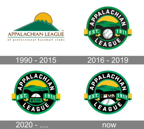
1990 – 2015

The old Appalachian League logo looked more like a picture than a sports logo. In use from 1990 to 2015, the emblem depicted a green mountain. There was a yellow sun above the mountain, while below it you could see the lettering “Appalachian League of professional baseball clubs.”
2016 – 2019
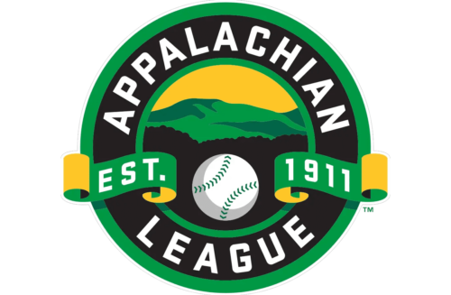
In 2015, the League introduced a new logo designed by Todd Radom. Similar to its predecessor, the emblem was inspired by the beauty of the Appalachian region. This time, the green mountain was complemented with black trees on the forefront and a baseball. The logo adopted a circle shape, while the lettering was reduced.
2020 – ….
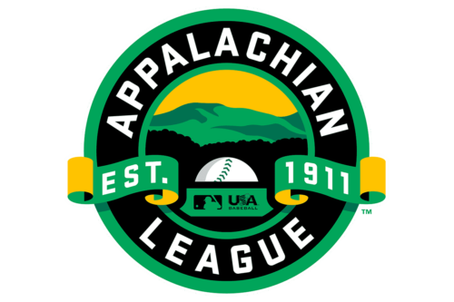
This logo was created as part of the rebranding done for the 2021 season. An additional element was added to the previous logo. It was a green banner that covered the lower half of the baseball ball. It had a silhouette of a baseball player on a smaller black rectangle with rounded corners on the left and “USA Baseball” printed on the right. It was meant to represent the collaboration between the MLB and USA Baseball called Prospect Development Pipeline.
Today
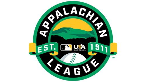
The logo elements were slightly rearranged. The baseball ball was placed at the bottom of the main circle and enlarged, which made it more clear that this is a baseball league without any inscriptions. The banner with the baseball player and “USA Baseball” inscription was moved above it and no longer had a green background. Its color palette was changed to white and yellow with a black background.
Font and color
The bold white inscription from the Appalachian League logo is set in a cool and modern sans-serif typeface with solid stable letters and diagonal cuts of some of the bars. The closest font to the typeface used for the league’s emblem is, probably, Poster Gothic ATF Bold. This typeface looks stylish due to the interesting contours of the letters — as some angles are softened, others are sharp, some bars are cut straight, and others — diagonally.
The Appalachian League logo features not only an interesting font but also a very intense and bright color palette, even though the main shade on the badge is black. Apart from white, used for the lettering and the baseball in the center of the emblem, the logo also boasts a solid and smooth shade of yellow and two shades of green, making up the mountain landscape in the background.


