Apal is the name of a Belgium automaking company, which was established in 1961. In 1998 the brand was acquired by the German Ostercappeln company and continued the production of the cars until 2006. Today Apal is specialized in the manufacturing of car parts.
Meaning and history
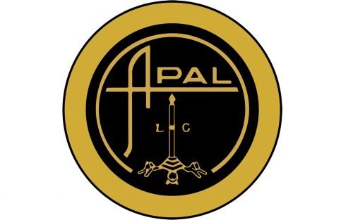
The logo of the Belgian automaker is very modern and confident. Composed of a single wordmark, executed in black and usually placed on white, the Apal badge has everything perfectly balanced. There is also a more ornate badge, which the main part is still taken by its stylish logotype.
The Apal (the name of the brand stands for Application Polyester Arme de Liege) nameplate is executed in a custom sans-serif typeface, where “Pal” part is written in a simple font, the one close to Stereo Gothic 800 with its straight clean lines, and the letter “A” is modernized. It has its left vertical bar arched and the horizontal line is elongated, creating an underline for the whole inscription. Another unique thing about the Apal “A” is the difference in lengths of its vertical bars, which makes the logo memorable and vivid.
As for the company’s emblem, it is composed of a circular logotype in black with a white outline. The bottom part is decorated by an ornate candlestick, from which an elegant high candle comes out. The flame touches the horizontal bar of “A”, underlining the wordmark, which is placed on the upper part of the circle. Two letters, “L” and “G” in a bold serif font placed from both sides of the candle.


