 American Football Conference Logo PNG
Meaning and history
The red soccer ball that can be clearly seen on the American Football League logo doesn’t leave any doubt as to what field the organization operates in. Above the soccer ball, there’s a bald eagle in red that appears to be moving at an extremely high speed. However, it’s not actually obvious whether it’s the eagle or the football that is flying.
Over the eagle, a large white letter “A” with a bright blue outline is positioned. In fact, it’s the only letter on the AFL logo, so for someone who isn’t in the know, it’s almost impossible to figure out what organization the logo belongs to. From both sides of the “A,” there’re three blue stars. The design is placed inside a thick blue ring, which is also given in the same bright shade of blue as the stars and the outline of the “A.”
The name “American Football League” was historically used by four organizations. None of them is still active. The first American Football League was established in 1926, the second one appeared ten years later. Another league of the same name was founded in 1940. Eventually, we should mention the most successful one, which was active for ten seasons from 1960 until 1969. After that, it became part of the older National Football League.
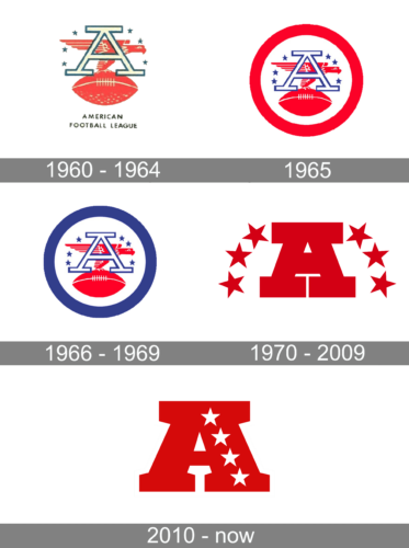
1960 – 1964
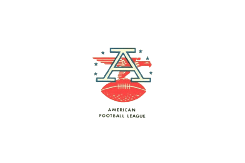
This logo is very symbolic as it has an off-white with a blue outline “A” initial that stands for American and a red eagle in the background with a red, white, and blue color palette that leaves no doubt that this is an American league. A football ball in the claws of the eagle makes it clear who the logo belongs to. A small inscription underneath in dark, all uppercase letters says “American Football League” in two lines. The logo turned out strong and courageous, while the flying eagle gives it some dynamics.
1965
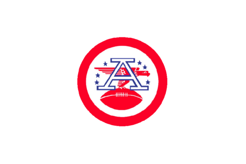
The previous logo was refined and the red color appears much brighter, being a good contrast to the white and saturated blue. The league removed the inscription underneath the emblem. It was replaced by a thick, red round border that gave the emblem a more confident and put-together look.
1966 – 1969
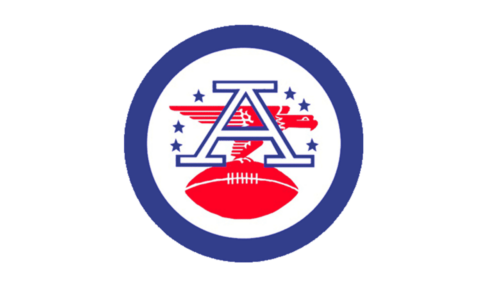
The updated version looks almost identical to the previous one. The red color of the border was replaced by a deep blue. This created a balance between red and blue in the logo and allowed all the elements to stand out instead of getting lost in the background.
1970 – 2009
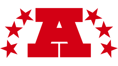
A striking, confident new identity was presented in 1970. The letter “A” featured extra thick lines and bold slab serifs. The red color enhanced the dashing appearance, while three large stars on either side completed the picture and drew a connection to the previous logos.
2010 – Today
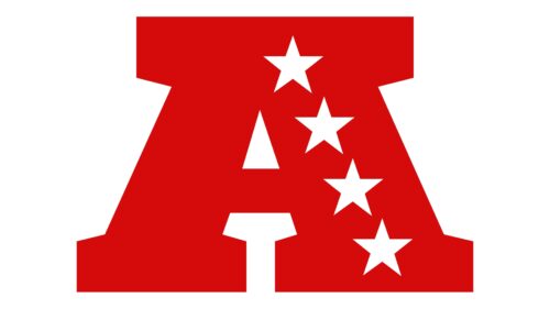
This logo is based on the previous one as it has a red “A” as the main element. The letter was made wider to compensate for the removal of the stars. The stars, by the way, were now placed on the right vertical stroke. There were four of them and their white color was a great contrasting choice. Another detail that was modified is the slab serifs. In this logo, they are no longer square but have one side cut on a diagonal. This created a more defined letter as in the previous case it was not instantly understood that this is an “A”.


