

![]() Alphabet Logo PNG
Alphabet Logo PNG
The Alphabet logo uses the language of visual symbols to explain the differences between the companies, Google and itself. In comparison with the Google logo, it looks more serious, like a grown-up in comparison with a teenager.
Meaning and history
![]()
In the summer of 2015, Google Inc. announced it was going to establish a new public holding company, Alphabet Inc. Alphabet became the parent company of Google and several former Google subsidiaries, including X Development, Calico, Nest, and Verily, to name just a few.
Alphabet Inc. is headquartered in Mountain View, California. It has been named the fifth largest tech company in the world by revenue. Also, it has been often mentioned among the most valuable companies in the world.
According to the company, the introduction of Alphabet was supposed to make Google’s main business “cleaner and more accountable” and also to provide more autonomy to the companies working in businesses not connected with Internet services.
What is Alphabet?
Alphabet is the name of a technology company in the United States, which was established in 2015 in Mountain View, California. The company is engaged in such spheres as Artificial Intelligence, Biotechnology, Robotics, Software, and many others.
Professional opinions on the emblem
Here are the opinions of several branding experts (from their interviews to Wired):
– “It’s playful in a … much subtler way,” says Natasha Jen, Pentagram partner. She notices the counter in the second “a” resembles a water drop.
– the new logo symbolizes “moving from adolescence into young adulthood,” says Steven Heller, design critic and author. He mentions it is “not as corporate as IBM or Westinghouse.” And yet, in his opinion, it is “simple and accessible.” He also emphasizes the attractive shape of the lowercase “a.”
– the “a” also caught an eye of Tobias Frere-Jones, typographer, but he does not approve of it at all. He claims, the letter looks “like it missed a week of letterform school.” In his opinion, its bottom curve is too heavy and breaks the whole word. “The three curves fight one another,” he adds.
Font
The wordmark features a slightly modified version of the type called Product Sans. It has been developed in-house and featured in the Google logo. Here, the shape of the glyphs helps to emphasize the lack of shadow and the high contrast of colors in the wordmark.
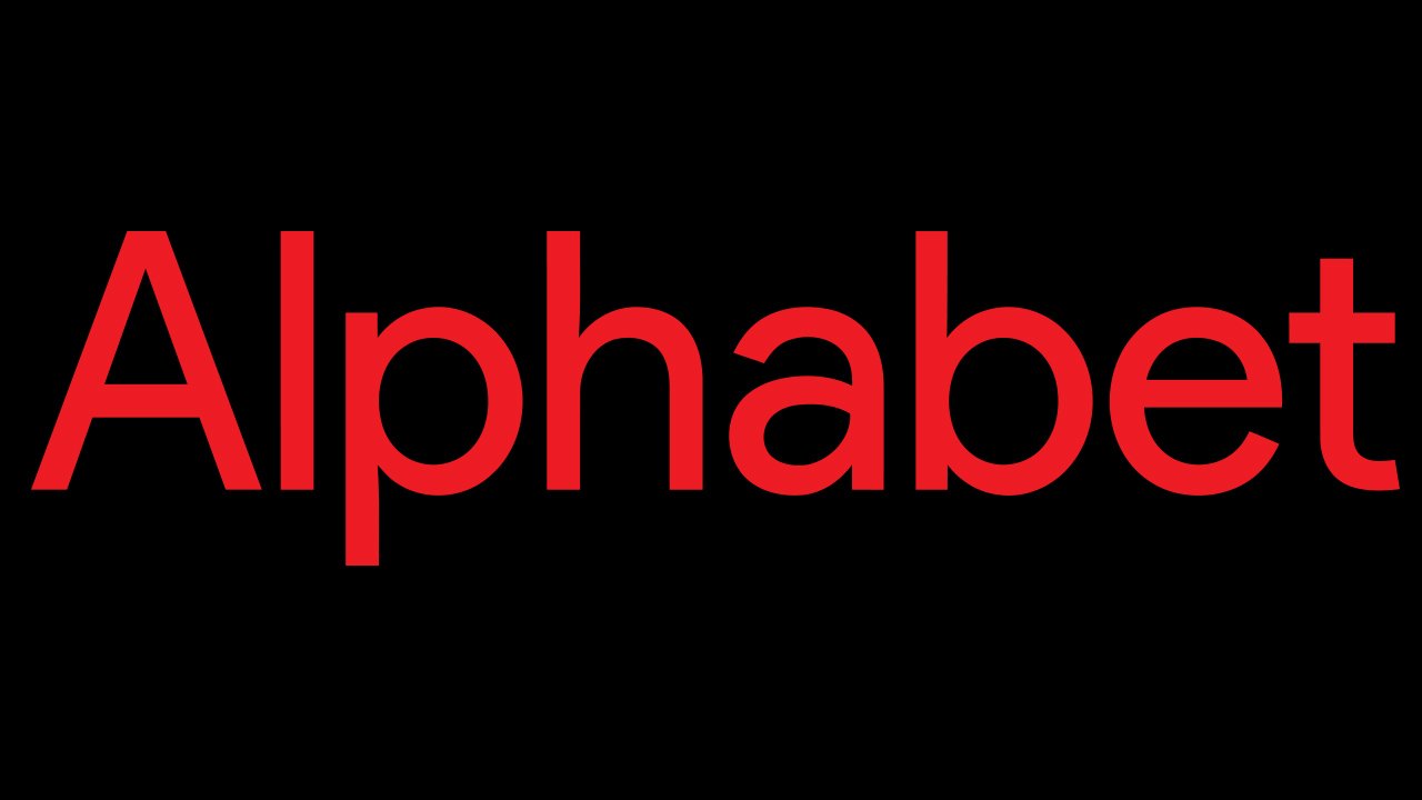
Colors
![]()
On the one hand, the vivid, eye-catching color used in the Alphabet logo does not look that serious and corporate. On the other hand, in comparison with the Google logo, it actually creates a different, more grown-up impression. In other words, the color supports the message conveyed by the design on the whole.


