 Allsvenskan (All-Swedish) Logo PNG
Meaning and history
The logo of Allsvenskan, the main league of the Swedish football league system, can be given in two versions: with or without the lettering.
The Allsvenskan logo is based on a stylized letter “A,” the initial of the name of the league. The “A” is formed by an “open” ring (a ring with a gap) with a vertical bar. The light grey letter is encircled by a thin yellow ring. Both the elements are positioned inside a dark blue circle. The All-Swedish logo has a barely discernible gradient texture providing a subtle 3D feel.
1996 — 2012
The original Allsvenskan logo was designed in 1996 and stayed with the league for almost sixteen years. It was a yellow, blue and white image set on a solid black background, which usually had a rectangular shape. The graphical part of the badge boasted a stylized white football surrounded by smooth lines in blue and yellow, and a slanted uppercase “Allsvenskan” logotype in a narrowed Sans-serif typeface, set on the bottom part of the badge.
2012 — 2019
In the full version, the name of the league in dark blue can be seen under the pictorial emblem. Below, there’s s the lettering “Sedan 1924.”
2019 — 2021
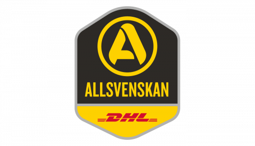
Their next logo is a tall hexagon shape, divided into two general sections. About ¾ above is occupied by the black space. Here, they’ve put their emblem – a yellow circle with a big, bold ‘A’ inside. Right below it, there was the word ‘Allsvenskan’ (means ‘All-Swedish’). The other section was yellow and contained a red wordmark of ‘DHL’ – the contemporary sponsor.
2021 — Today
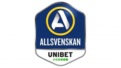
In 2021, they changed the color scheme. The upper bit changed to a combination of yellow, white and blue (after the Swedish flag). They also added a bit of lighting and other 3D elements here. The sponsor part was now occupied by a Unibet logo, placed against a white background.


