While the Alitalia logo has gone through around five updates since 1946, you can notice there is some consistency in its style – it has been rather an evolution than a series of revolutions.
Meaning and history
Alitalia was founded in 1946. Today it is one of the top 5 best airlines in Europe. Over the many years of its operation, the airline managed to exist for some time under a different name, as well as to significantly expand the map of flights and the aircraft fleet.
The air carrier is the national company of Italy. Its capacity allows it to achieve the highest passenger turnover of any company in Europe.
The company was owned by the Italian government until 2009, when it became a private company after its reorganization and merger with the bankrupt Italian airline Air One. Alitalia reorganized again in 2015 after receiving an investment from Etihad Airways, with Air France-KLM already holding a minority stake. After several failed attempts to make the airline profitable, the airline was placed under emergency management in 2017, just days after Etihad Airways ended its support for Alitalia. On May 17, 2017, after the government ruled out nationalizing the airline, it was officially auctioned off.
After several unsuccessful negotiations with Delta Air Lines, EasyJet, Ferrovie dello Stato Italiane and China Eastern Airlines, the Italian government became the owner of the airline in March 2020. unable to survive the impact of the COVID-19 pandemic on its own. On October 10, 2020, the Italian government signed a decree authorizing the airline to reorganize as Italia Trasporto Aereo S.p.A., or ITA Airways.
What is Alitalia?
Alitalia is the former national air carrier of Italy, which was established in 1946, and claimed itself a bankrupt in 2021, being bought by ITA Airways. The company used to have a fleet of 84 aircraft, flying to almost 100 locations across the globe.
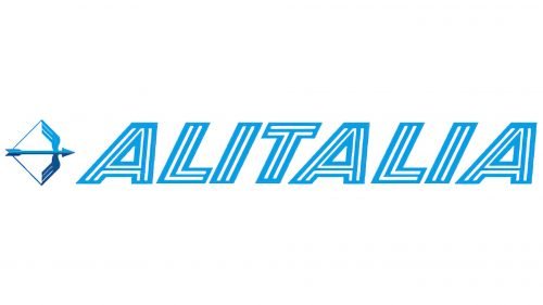
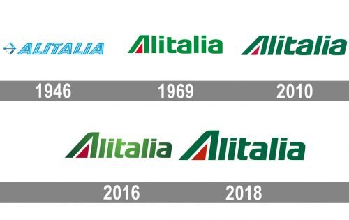
1946
The original design comprised a winged arrow (so-called “Freccia Alata”) as a symbol of speed.
1969
The wordmark developed by Landor Associates showcased the word “Alitalia” in green with a red triangle inside the “A.”
2010
Designers from Saatchi&Saatchi who were responsible for the update opted for darker shades of red and green. They italicized the wordmark and made subtle modifications to the type.
2016
The type was slightly altered once again.
2018
In 2018 the badge was redrawn in a plain two-dimensional way again. All the gradient shades were gone and the iconic deep green color was returned to the Alitalia logo, gaining an even more intense and “expensive” shade. The letters in the logo got enlarged and their contours — cleaned. Overall, the shapes and styles were not changed much, but the mood, spirit, and meaning of the symbols became stronger and more confident.
Font and color
The Alitalia logotype is executed in a custom sans-serif typeface with massive shapes and thick lines. The first letter “A” is stylized with the sharp red triangle inside, while all other letters of the wordmark look pretty close to the letters of such fonts as FF Signa Pro Extended Black Italic and Rogue Sans Nova Bold Extended Italic, but with contours cleaned, modified and sharpened.
As for the color palette, the Alitalia visual identity is based on deep calm shades of green and red and usually uses white as the background. The combination of these three colors is a symbol of patriotism and celebration of Italian spirit and style. Green also stands for life and growth, while red is a color of passion, love, and power, and white is a shade of loyalty and transparency.


