ADT is the abbreviation standing for the American District Telegraph, which was the original name of the company, established in 1874. Today this American corporation is specialized in alarm and security services and works all over the United States, known as one of the most reliable providers in the industry.
Meaning and history
The company was born at the end of the 19th century as the first telegraph-alarm service provider in the USA. Since its first years, American District Telegraph has been growing and developing, and by today it is one of the most reputable and technologically innovative alarms and security companies.
What is ADT?
ADT, formerly American District Telegraph, is the security alarm service provider, which was established in the middle of the 1870s in the United States. Since 2016 the company is owned by Apollo Global Management.
1874 – 1959
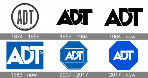
The very first ADT badge was designed in 1874, right after the established end of the American District Telegraph, and stayed in use for more than eighty years, which is a very impressive number. The original badge was executed in monochrome and featured three narrowed sans-serif letters enclosed into a circular frame.
1959 – 1964
The redesign of 1959 removed the framing from the badge and made the abbreviation bolder and more massive. Now three heavy black capitals were set too close to each other, overlapping. The straight contours and cuts of the lines added some geometry to the badge, and two solid black dots, placed in a diagonal line around the “D” made it look unique and a little playful.
1964 – Today
The logo, created for the company in 1964, can still be seen on some products and documents of ADT. It is a simple and strict badge with just the company’s name abbreviation, which repeats the placement of the letters from the previous version, but is executed in a different typeface. The sans-serif font has its bold letters in thinner lines, straighter contours, and cleaner execution. The black inscription looks professional and stable, reflecting the main characteristics of the company.
1989 – Today
The company was officially renamed ADT in 1989, and the new logo was designed in the same year. Although the idea and style were taken from the previous badge — just three letters — the refreshed color palette made it look completely different. Now the abbreviation was set in white on a bright blue background. Blue is the color, which is most often associated with technological companies, innovations, and reliability. The logo is still used by ADT today.
2007 – 2017
The redesign of 2007 introduced a more complicated version of the ADT logo. The white abbreviation was still set on a blue background, but this time was enclosed in a horizontally oriented white rectangle, which was set on an octagon, with double white framing. This badge was used as the primary logo for almost ten years.
2017 – Today
In 2017 the ADT octagon got simplified: all frames (both the main and the rectangular ones) were removed, and now it was just a white inscription on a blue background again. Although the most important change of 2017 was in the adoption of a new shade of blue — the brighter and more intense one, which made the octagon eye-catching and memorable.


