The modification that the DPD logo went through in 2015 reflected the structural changes in its parent company.
Meaning and history
The roots of the modern delivery business DPD can be traced to the middle of the 1970s, when the company, named Deutscher Paketdienst (which is translated as “German Parcel Service”) was established. Already in 1979, the company entered the international parcel market. And in 1984 the cube-shaped logo was presented for the first time, which became the basis for the modern version.
The next stage in the development of DPD can be called the emergence in 1999 of the French holding GeoPost, whichwas controlled by the French company La Poste. It was this company that, in 2001, acquired more than 83% of the shares of the German business, as well as a number of operating transportation companies in other countries.
Initially, cargo delivery activities were carried out under different brands. But in 2006 it was decided to move them all to a single brand, and as the last one DPD was chosen.
What is DPD?
DPD is the short name for Deutscher Paketdienst, or Dynamic Parcel Distribution, an international network of companies (operating in more than 20 countries across Europe), founded in the mid-1970s and engaged in the transportation of goods weighing up to 30 kg.
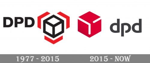
1977 – 2015
The pictorial part of the old logo featured a white 3D cube with black sides. It looked like a hexagon divided into three identical fields. Around the hexagon, there were three identical boomerang shapes in red, which mirrored the shape of the sides of the cube and also resembled arrows.
The cube could be interpreted as a base, a storage place, from which parcels are being delivered in various directions (arrows symbolize motion).
To the left, the name of the brand in black could be seen. The letters were capitalized. They featured an austere and perfectly legible sans.
2015 – Today
The cube has moved to the left and was colored red, while the lettering has grown smaller. As a result, the design is now dominated by the cube. It has grown more refined, and there is more depth to it. It has got a unique touch due to the unfinished lines in the center. The “unfinished” effect echoes in the shape of the letter “p” with the white gap.
The introduction of the new logo coincided with important events inside the company. In 2015, GeoPost joined its brands DPD, Chronopost, Exapaq, and Seur under one brand DPDgroup.
The cube shape became the primary visual symbol of the connection between the units. Exapaq was renamed DPD France, while the emblem of Chronopost now featured a blue cube and a new type showing it was part of DPDgroup.
The new design was developed by the London office of Lippincott.
Font
In addition to being minimalist and echoing the shape of the cube, the type on the DPD logo has one more advantage. The “d’s” and the “p” seem to have a similar shape, which makes them look as if they are the same letter rotated 180 degrees (we do not take into consideration the gap on the “p,” of course). This approach helps to create a visual connection between the letters making them look like parts of a single whole.
Company overview
While the DPDgroup in its current form was established in 1999, its roots can be traced to the 1980s, when Le Groupe La Poste started to provide express transport services using the Chronopost brand.
Today, DPD is an international parcel delivery system delivering 5.3 million parcels every day. The group is headquartered in Issy Les Moulineaux, France.
Font and Color
The bold lowercase lettering from the official DPD logo is set in a stylized modern sans-serif font with the contour of the “P” opened. The closest typefaces to the one, used in this insignia, are, probably, Constellation Bold, Camaro SemiBold, or Tabasco, with some visible modifications of the characters’ contours.
As for the color palette of the DPD visual identity, it is based on a very elegant combination of pinkish red and dark gray, the two shades which together look very stylish and confident, making up a very eye-catching logo, which represents a professional and reliable company.


