The first Pampers logo to ever appear was the one on the test packages introduced into the market in Illinois in 1961. The packages featured a simple blue wordmark with a red angled bar. Also, there was a visual realization of the brand’s promise: a picture of a sleeping baby.
Meaning and history
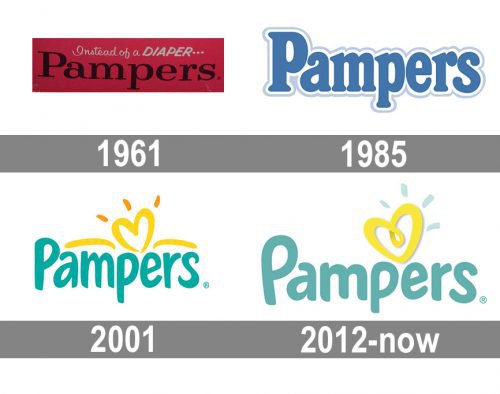
Shortly after, as the product was introduced into a broader market, it adopted a slightly different logo. In addition to the name of the company, the insignia incorporated a dot and a slogan, which actually looked more like an explanation: “Instead of a diaper…”. The wordmark had a red-and-black color scheme.
1961

The original Pampers logo had nothing in common with the current one. There was the black name of the brand in a light serif type over the maroon background.
1985

The blue color was first used. The type grew plumper, friendlier.
2001

The blue grew somewhat warmer and lighter, while the heart appeared at the top. The type was replaced by a more playful one.
2012

A couple of yellow strokes above the logo disappeared, while the glyphs were slightly updated.
Font
The current version of the Pampers logo sports a unique sans-serif type looking a bit “fluffier” than the previous one.
Color
The color scheme includes two basic colors – aqua and yellow – on the white background. The previous version featured orange, in addition to these colors.


