Zillow Group is known for its online real estate database providing useful information about more than 100 million homes across the US. For instance, it provides data on how the value of the homes has been changing in the course of time. The advertising network Zillow launched in early 2011 in collaboration with Yahoo! is considered the largest one in the real estate business.
Meaning and history
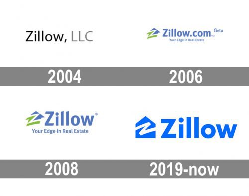
This is a meaningful logotype giving you a hint as to what sphere the company specializes in. You can tell at a glance that the brand works in real estate business. A stylized depiction of a house serves as a background for the letter “Z”. The house design is put inside a blue square. The word “Zillow” can be placed either on the right, or below the icon.
2004 — 2006
Unlike the current Zillow logo, the old one wasn’t meaningful. It did its job, though, as it was perfectly legible and easy to reproduce.
2006 — 2008
The “Z house” emblem first appeared in the logo in 2006. In the original version, the letter divided the house into two parts, the blue top and the green lower part.
The typographical part featured the full name of the website paired with the lettering “Beta” and “Your Edge in Real Estate.” The type was bolder than in the previous logo.
2008 — 2019
The writing “.com” and “beta” disappeared leaving a cleaner, easier-to-grasp design.
2019 — Today
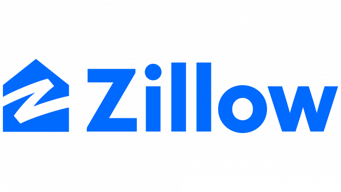
The design has grown even cleaner due to the new palette. The combination of green and a grayish shade of blue was replaced by a bright blue tint.
The house was straightened. The type grew simpler (for instance, the “i” and the “l’s” lost their diagonal tops).
Premier Agent symbol
The Premier Agent badge is used by real estate agents to show they participate in the namesake program. The logo is based on a modified house icon from the regular Zillow logo. The letter “Z” is replaced by “P,” which “cuts” the number “1” out of the house. The words “Premier Agent” are place below, as well as references to Zillow and trulia.
Old Premier Agent emblem
Earlier, the company used a seal-like icon with an uneven green border imitating wax of a real seal. There was a “Premier Agent” banner, as well as the regular Zillow icon and the name of the database.
Font
The typeface on the Zillow logo may look pretty generic at first glance, and yet it is recognizable due to the sharp angles on the ends of the letter “Z”, the vertexes of the letters “l”, and the top of the “i”.
Color
The standard logotype is given in bright blue and white. However, another version, where green is used in addition to blue and white, can also be seen. The Premier Agent icon can be given in several versions featuring two shades of blue (a darker and a brighter one), green, black, and white.


