The world’s leading digital payment company, PayPal has been criticized for its slightly dated logo more than once. However, for a company dealing with online money transfer, it is only natural to avoid changing its identity too often, as it clearly raises the possibility of scam. The latest PayPal logo update has made it more visually appealing.
Meaning and history

PayPal was founded in late 1998 under the name of Confinity. Originally it specialized in security software. However, in 2000, after the merge with the online banking company X.com, its main focus moved to money transfer business. It was then that the company became well-known under its current name and got its first logo, which was just a white wordmark with a blue border.
What is PayPal?
PayPal is the name of one of the world’s oldest and most popular online payment systems, which was created in 1998 and for the first few months was named Confinity. The original specialization of the company was computer security, so the users of PayPal can be confident and feel protected.
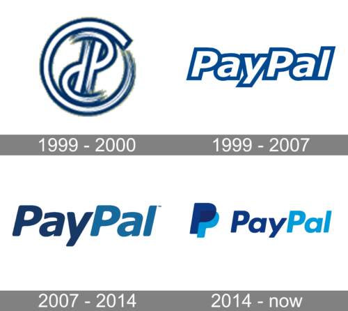
1999 – 2000

The earlier logotype was a small round icon that included two letters ‘P’. They were placed back-to-back with one letter upside-down, and the designers also added a hazed effect to parts of this logo to make it appear mid-motion. To this end, they’ve also tilted the letters.
The emblem is mostly white with dark blue borders around all elements.
1999 – 2007

The very first logo for PayPal was introduced in 1999 and stayed with the famous online wallet for eight years. It was a white inscription where each of the letters featured a thick blue outline. The lettering was executed in a modern sans-serif typeface with distinct contours and sharp angles. The italicized letters were glued to each other.
2007 – 2014
In 2007 the PayPal insignia went through a drastic change. Instead of the white wordmark, the company received an emblem featuring two shades of blue. Also, the typeface became cleaner, while the space between the letters grew larger. It was clearly an improvement in terms of legibility. However, some designers pointed out that the older wordmark worked better on various background colors, while the new one could not provide good contrast on certain backgrounds (blue, for instance).
In 2012 the wordmark was given a minor facelift, due to which the typeface grew slightly rounder.
2014 – Today
Probably, the most successful PayPal logo so far has been the one introduced in 2014. The campaign was designed by San Francisco, CA-based design firm and included not only a new wordmark, but also an icon and a new PayPal interface. It was an absolutely logical move, taking into consideration the rise of mobile technologies.
There are two key themes for the company’s new identity: connection and forwardness. The former is supposed to be emphasized by the monogram with overlapping double P, while the idea of forwardness is communicated through the strengthened italics.
Icon
The PayPal Icon is executed in the iconic color palette of the payment system. The white, light blue, and dark blue colors make the simple and minimalist image bright and instantly recognizable.
The icon is composed of a gradient blue square as a background and two overlapping letters “P” in white and a very light shade of blue, closer to sky-gray.
This combination of colors evokes a sense of reliability and professionalism, showing the serious approach of the company to its mission and purpose, and at the same time readiness to implements all the latest technologies to simplify the processes.
Font
The clean, round sans-serif type of the 2014 PayPal logo may seem very similar to the one used in the previous emblem. However, there are a couple of differences. The most noticeable one is the new “a” character. Also, the letters seem to have grown a bit wider, which is especially visible when you look at the “y” character.
Color
PayPal has always stuck to blue in terms of the corporate color, yet the shade has been modified. With the brighter shades used in the current version, the company seems to be better competing against other payment gateways.
Who designed the PayPal logo?
The PayPal logo was designed by the Fuseproject design bureaux. The designers’ team was led by Yves Behar, who helped them succeed in creating the iconic logo with the monogram, which today is associated with secure online Peugeots and instant money transfers.
What color is the PayPal logo?
The color palette of PayPal’s visual identity is based on two shades of blue is often chosen by technology brands and businesses connected to finance, as this color symbolizes security and loyalty. The PayPal badge uses the light blue 2935 C Pantone, and the darker shade, which is 648 C Pantone.


