GCash is an all-in-one application that allows users to make secure online and in-store payments, as well as cell phone top-ups and bill payments. The app was developed in the Philippines and released in 2004. Today there are versions available for both Android and iOS operating systems.
Meaning and history
GCash is a popular e-wallet and mobile payment service created in the Philippines in 2004. It is a kind of breakthrough in the local market, which is already used by more than 60 million people today.
Like other e-wallets, GCash makes it easy to make payments on the go, send money, pay bills, and shop online or in-store without the need for cashing out.
GCash supports iOS and Android operating systems. First, you need to download it from Google Play or the App Store. Updated versions are released for iOS earlier than for Android.
After installing it, you just need to go through a simple registration. GCash will ask for your full name, date of birth, residential address, and email. Also, it is mandatory to have a cell phone number to create an account in GCash.
What is GCash?
GCash is the name of a mobile app that allows you to instantly pay bills, pay for online purchases, send money to friends, and more – all from the comfort of your own home. GCash mobile wallet connects to your cell phone number and allows you to conveniently and securely make payments wherever you are.
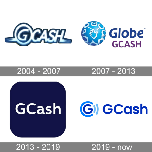
In terms of visual identity, GCash has already changed several images, starting with intense and ornate badges, trying a super minimalistic concept, and finally getting to something in the middle.
2004 – 2007
The original GCash logo, created in 2004, stayed with the application for about three years. It was a stylized inscription in white-to-blue gradients, with a bold dark-blue outline and some yellowish tones at the bottom. The lettering looked pretty futuristic due to the solid shapes and elongated lines of the strokes, coming out of it to the sides. The “G” in the logo was enclosed into a circular frame, with a solid blue background in the negative space.
2007 – 2013
The redesign of 2007 was held after the rename of the company to Globe GCash. The new badge became literally a graphical representation of the new name, with a three-dimensional blue globe placed on the left from a two-leveled inscription, and executed in blue and purple. The globe boasted some white decorative elements, depicting mobile icons, with a hand in the center.
2013 – 2019
In 2013 the company returned to its original name, GCash, and this is when the second era of the mobile app started, celebrated with the new logo. The modernized visual identity of the application was based on a minimalistic design, with clean white sans-serif lettering written against a solid dark-blue square with rounded angles. There was nothing else on the icon, and it looked very stable and professional, staying unchanged for more than six years.
2019 – Today
The redesign of 2019 has created a friendlier image for the application, adopting brighter shades of blue for the new badge. The new primary logo of GCash is composed of white lettering in a refined sans-serif typeface, written against a bright blue background and accompanied by a laconic emblem, depicting a white capital “G” in a rounded font, enclosed into a circular frame, formed by an open dark-blue ring and two short arched lines in a lighter shade of blue, placed on the right from the letter and symbolizing the connection sign.
Font and color
The clean and stable title case lettering from the primary logo of the GCash application is set in a modern geometric sans-serif typeface with distinctive contours of the full-shaped characters. The closest fonts to the one, used in this insignia, are, probably, Caros Soft Medium, or Neometeic Alt Medium.
As for the color palette of the GVash visual identity, it is based on a combination of white and several shades of blue. Blue is the most popular choice for the brands, connected to finance and IT, as it stands for reliability and innovations; while white elevates the sense of security and expertise.


