Apple Pay is a system of mobile online payments and an electronic wallet service introduced in September 2014 by Apple Inc. Using the system, its clients are able to effect payments in person or through the web facilities with the help of applications resident in iOS of the iPhones. Nowadays, the system is supported by all the Apple devices, including Apple Watch. Launched initially in the USA, Apple Pay operates now on all the continents except for Africa.
Meaning and history
In 2014, Apple unveiled its new Apple Pay payment service, which epitomized the company’s first step toward its goal of replacing your wallet with an “easy, secure, and private” means of payment.
Apple Pay is a mobile and digital wallet payment service that allows users to make payments in person, in iOS apps, and online using the Safari browser. The service works on iPhone, Apple Watch, iPad and Mac.
Payments through Apple Pay are accepted wherever the specified symbols and designations are present: in stores, apps, and on web pages in the Safari browser. You can add credit, debit, or prepaid cards from participating banks and card issuers in the following countries and regions.
Contactless payment technology has been used for quite a long time – since the middle of the first decade of the 21st century. The first patent applications, which were directly related to the payment system, began to appear in 2008. But in the interval between that and the appearance of ApplePay, the system did not gain popularity. The more advantageous position was Apple’s.
Apple Pay service is compatible with many existing contactless readers: Visa PayWave, MasterCard PayPass, American Express, and ExpressDay.
In addition to the fact that the Apple service is supported by hundreds of banks, you can pay with your smartphone at any terminals that support contactless payment methods.
With the arrival of iOS9, Apple has made a few changes to Apple Pay and its associated app. In 2015, the Passbook app got a new name – Wallet. Just like before the app store coupons, boarding passes, event tickets, and credit and debit cards that could be used to pay with Apple Pay.
With the arrival of iOS 11, in 2017, Wallet started to have an option to prevent sharing a card. This feature is useful for one-time use cards like discount coupons or event tickets. On earlier versions of iOS, this feature is not yet available. Starting with iOS 11, Apple began supporting a more secure type of NFC-enabled cards called encrypted NFC cards.
What is Apple Pay?
Apple Pay is the name of a contactless payment service from Apple, which was introduced in 2014. It is a convenient payment option for the modern person with several security features that provide the user with a higher level of security than a traditional credit card.
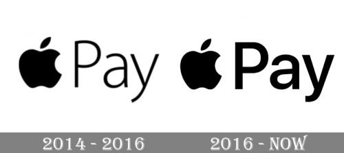
2014 – 2016

In 2016 the Apple Pay logo was redesigned, though both elements remained where they were from the beginning. The contours of both the Apple and the logotype were emboldened and cleaned, and the emblem became a bit smaller than the inscription. The typeface of the “Pay” part of the logo became more confident and powerful.
The very first Apple Pay logo featured the iconic Apple emblem in a solid plank placed on the left from a delicate medium-weight “Pay” inscription in the title case. The sans-serif typeface w
If the wordmark added lightness and professionalism to the whole badge.
2016 – Today

The Apple with a bite mark on the right side is one of the most recognizable symbols in civilized countries but its meaning is surrounded by many rumours and mysteries. One of the versions is a connection with the brilliant physicist Isaac Newton, who discovered the law of gravity with the help of an apple. This version is supported by the design of the initial logo for Apple computers made back in 1976 which depicted Newton under the apple tree with an apple over his head.

Another explanation for the origin of the Apple is that the founder of the company Steve Jobs by choosing this emblem paid tribute to the English mathematician Alan Turing, who according to the official version committed suicide by biting into an apple laced with cyanide. Jobs used to add fuel to the fire by constantly dodging questions about the meaning of the logo, making reporters think he was afraid of causing substantial losses to the Corporation by revealing that the logo had to do with the identity of Turing, who had been prosecuted for homosexuality.
The official version is that Steve Jobs tasked the logo’s designer Rob Janoff to make a simple and memorable emblem and opted for the version with a bite mark as he thought that without it clients would mistake the apple for a cherry.
Colours and font
The logo is made in saturated black and white colours. It exists in three versions: black apple image and wordmark in pale blue and white chequered rectangle or against a white background and white emblem and wordmark against a black background.
The font used for the logo is SF Pro Display, with a Semibold weight. The font’s clear graphics and bold lines make it convenient for use on mobile devices having screens of smaller size, first of all, iPhone and Apple Watch.


