The New York Mets logo has stayed almost the same since it was created in 1962. Only three hardly noticeable modifications have been made.
Meaning and history
New York Mets are the baseball club that has probably the least amount of its logo redesigns, as it still uses two emblems, designed in 1962, and just one of them was slightly refined and modernized throughout the years. The original emblem of the club was taken from the last logo of New York Giants when the club splint in two and turned into San Francisco Giants and New York Mets.
What are Mets?
Mets are the name of a legendary baseball club from the United States, which was established in New York in 1962, and today plays in the East Division of the Major League Baseball, the top-tier league in the USA. The club is based in New York, is owned by Steve Cohen, and is managed by Billy Eppler.
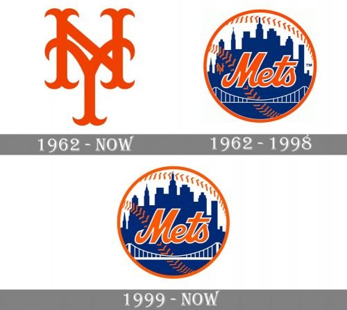
1962 — Today
The logo, borrowed by New York Mets from New York Giants, was composed of two red overlapping letters “NY” placed vertically (with the “N” higher than the “Y”). Both letters had their lines’ tails forked, curved and pointed, except for the upper bars of the “E”, which were just arched to the sides, resembling sharp animal horns.
1962 — 1998
Later in the same year, a new badge was created for the club. It was a rounded white, blue and orange emblem with the skyscrapers landscape contouring, orange stitched and a bold cursive “Mets” inscription executed in thick orange lines with a thin white outline. On the left from the main wordmark, there was a tiny orange “NY” symbol with both letters in a simple sans-serif typeface. The emblem featured a distinct orange frame and resembled a baseball.
1999 — Today
The redesign of 1999 removed the “NY” monogram from the emblem and elevated its color palette, using a brighter and darker shade of blue for the New York City landscape and a more intense orange, closer to coral, for the stitches and the nameplate.
Font
The logo uses a beautiful script typeface resembling handwriting.
Did the Mets change their logo?
Throughout the years, the logo of the New York Mets was redesigned twice, although both redesigns were more refinements, which only cleaned up the contours and enhanced the color palette of the iconic badge, created for the club in 1962.
What bridge is on the Mets logo?
The bridge on the badge of New York Mets is not a particular bridge, but a graphical representation of numerous bridges of New York City, which connect districts of the city to each other.
Who created the Mets logo?
The Mets logo was designed in 1972 by Rufus A. “Ray” Gotto, was an American artist, who became famous for his comics and cartoons on sports themes, specifically baseball. He was not ordered the creation of the logo, as it was a nationwide competition with a prize fund of one thousand dollars, which Ray won.
Why do the Mets have orange in their uniform?
Orange is one of the two official colors of the New York Mets. The color palette of the club is composed of orange and blue, with an addition of white. These two intense shades represent the historical legacy of the team, which was established as a result of a merger of two clubs, the Brooklyn Dodgers and the New York Giants. Blue was the color of the Dodgers, while orange was used by the Giants.
Colors
BLUE
PANTONE: PMS 288 C
HEX COLOR: #002D72;
RGB: (0, 45, 114)
CMYK: (100, 65, 00, 30)
ORANGE
PANTONE: PMS 1655 C
HEX COLOR: #FF5910;
RGB: (252, 89, 16)
CMYK: (00, 65, 87, 00)


