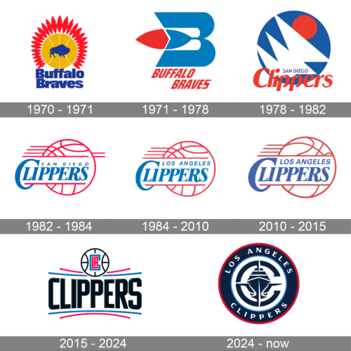
The depiction of a basketball has almost always been the core of the Los Angeles Clippers logo, with the exception of the 1972 version. In most cases, the logotype has been redesigned when the team changed its location and/or name.
Meaning and history
Los Angeles Clippers have jumped and changed their names several times throughout the years. The professional basketball club, which today plays in Los Angeles, was founded in the beginning of the 1970s in Buffalo, New York, and were named Buffalo Braves.
In 1978 Buffalo Braves moved to San Diego, with the name changed according to its new location, and the “Braves” replaced by the “Clippers”. Their San Diego period lasted for only six seasons, and already in 1984, the Clippers moved to Los Angeles.
Today the club has Crypto Com Arena as its home ground, PayPal Honey as the main sponsor, and Tyronn Lue as the head coach.
What is Los Angeles Clippers?
Los Angeles Clippers is the name of a professional basketball club from the United States, which was established in 1979 as Buffalo Braves. Today the club plays is the National Basketball Association, and is a member of the Western Conference, with two division titles won in 2013 and 2014.
1970 – 1971
Though the history of the basketball club from Los Angeles dates back to 1970 when it was established under the name Buffalo Braves, the Clippers era started in 1978, in San Diego and this is when their first logo was introduced to the public.
1971 – 1978
The redesign of the Buffalo Braves badge, held in 1971, has introduced a completely new concept, with the tender blue, white and red color palette. The new badge boasted a stylized heavy capital “B” with its horizontal bar forming a red and white feather, and its vertical bar being arched to the center. This was a graphical tribute to the Native American tribes, which looked very stylish and contemporary. This badge was used by the club for seven years, until their more to San Diego, and the following name change.
1978 – 1982
The first San Diego Clippers logo was bright and stylish. It was a geometric combination where three overlapping triangular sails were placed on a solid blue circle and had a red sun coming out of them. The “San Diego” inscription in small blur letters was written along the bottom part of the emblem, while the enlarged red “Clippers” in a title case was crossing the badge.
1982 – 1984
In 1982 the logo was redesigned in a more sporty way, to represent basketball and the essence of the club. It was a red and white contoured ball with a Two leveled blue inscription on it and some horizontal red stripes coming out on the rounded contour, to represent movement and energy.
1984 – 2010

In 1984 the club relocated to Los Angeles, changes its name and the inscription on the emblem. Another change in the visual identity was in the removal of two horizontal stripes from the right part of the ball. All the other elements, including the color palette and typeface, remained untouched.
2010 – 2015
The color palette of the Los Angeles Clippers’ visual identity was elevated in 2010, by bringing darker shades of both blue and red. The inscription was also slightly refined and started looking stronger and more professional, with its clean bold lines of the italicized letters.
2015 – 2024
The redesign of 2015 introduced a new logo concept. The emblem now featured a stylized white basketball in a black outline with a “CLA” monogram in the middle, placed above the enlarged “Clippers” wordmark in all capitals of a bold and modern Sans-serif typeface with rounded angles and straight cuts. The inscription is set between blue and red horizontal lines above and under it, adding playfulness and lightness to solid lettering shapes.
2024 – Today
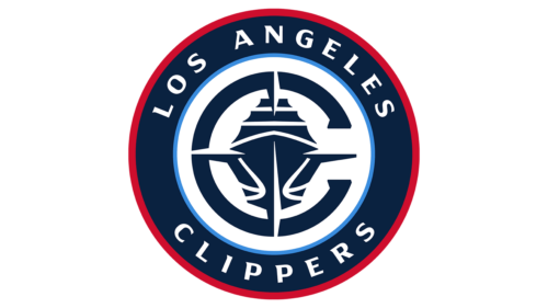
The emblem depicted is a circular crest with a maritime steering wheel at the center, representing the helm of a ship. The wheel is encompassed by two white, curved basketball lines, which confirm the team’s association with the sport. The name “Los Angeles Clippers” is emblazoned around the perimeter of the circle, with “Los Angeles” at the top and “Clippers” at the bottom, both separated by stars. The color scheme of red, white, and blue is patriotic and commonly associated with American sports teams, suggesting vigor and competitiveness. The overall design is balanced, bold, and emblematic of the team’s identity and spirit.
Font

The Baskerville Old Serial Heavy font, published by SoftMaker, seems very close to the one used on the old wordmark, while the Clippers new logo features a customized sans serif typeface.
Colors
In 2015, the Clippers added black to the long-standing trio of red, white, and blue. Moreover, silver is also mentioned among the team’s official colors, although it is hardly possible to see it on the logotype. If one takes a closer look, however, he or she may notice the silver lining.
RED
PANTONE: 186
HEX COLOR: #C8102E;
RGB: (200,16,46)
CMYK: (2,100,85,6)
BLUE
PANTONE: 7687
HEX COLOR: #1D428A;
RGB: (29,66,148)
CMYK: (100,78,0,18)
SILVER
PANTONE: COOL GRAY 5
HEX COLOR: #BEC0C2;
RGB: (190,192,194)
CMYK: (0,0,0,29)
BLACK
HEX COLOR: #000000;
RGB: (0,0,0)
HSB: (204,100,0)
CMYK: (75,68,67,90)


