

![]() Jeep Logo PNG
Jeep Logo PNG
The Jeep brand is one of the few that has managed to become a household name for four-wheel drive vehicles. Probably it is exactly because the present-day owners of the brand are not too concerned with improving the graphic representation of their brand, that is the logo, but have focused on improving technical issues.
Meaning and history
![]()
The founding fathers of the cars that were later named Jeep are considered to be the American engineer Arthur Herrington who worked in France, the Norwegian engineer Karl Probst and a number of other specialists from different companies who in the 1940s worked on making a lightweight off-road vehicle. Willys MA, Bantam BRC and Ford GPW are sometimes referred to as the prototypes of the subsequent Jeep cars. Because of these misunderstandings and claims to the brand, the companies have even met in court. As a result, in the first years the cars of the company were produced under the Willys brand name. What concerns the independent brand and logo (in font), they were registered in 1950.
The very name of the brand came from the abbreviation GP, which stands for “General Purpose” ‒ vehicles for general (versatile) purpose. Phonetically, the designation was transformed into Jeep and the name became commonly used.
There is another version of the origin of the brand name. Ford Motor used another abbreviation, GPW, which meant state-owned cars with a wheelbase of up to 80 inches produced in the performance of the government contract and licensed by Willys. This version is more widespread, but it is considered less realistic.
However, there was also a comic book character Eugene the Jeep that appeared in 1936. His main characteristic was exceptional pushfulness, so a vehicle of high passing ability was simply doomed to such a nickname.
Today the Jeep brand belongs to the American automobile concern Chrysler.
1941 – 1945
![]()
The initial Jeep badge was executed in a red and black color palette and composed of two text lines — the upper one in red capitals, saying “Jeep”, with the first “J” enlarged, and the black “Bantam. Willys. Ford” tagline with three parts separated by solid black dots. The bottom line was also written in a bold sans-serif font, but a simpler and cleaner one, than the “Jeep”.
1945 – 1963
![]()
The redesign of 1945 introduced a monochrome logotype with the “Jeep” in a title case executed in an extra-bold serif font with smooth sleek lines accompanied by thin elongated geometric serifs with straight distinct edges. The logotype was enclosed between two delicate quote symbols, which added uniqueness and playfulness to the whole image.
1963 – 1970
![]()
In 1963 the most colorful Jeep badge was created. It was a glossy circular badge in a thick silver framing. The body of the badge was divided into four equal segments in red and dark yellow, with silver separation lines. The logotype was placed in the central part of the emblem, on a light cream background, splitting the grout segments horizontally into two “zones”.
1970 – now
![]()
1970 – 1987
![]()
The Jeep logo from 1970 featured a cool geometric emblem, formed by a red triangle, touching the vertically placed bright blue rectangle with its upper right corner. The black title case inscription was executed in a full-shaped bold sans-serif typeface with clean contours. The logo looked very modern and stylish.
1987 – 1993
![]()
The iconic Chrysler Pentastar appeared on the Jeep logo in 1987. It was a solid black square with rounded angles, a white bold sans-serif lettering written along the bottom half of the emblem, and a white pentagon with thin black rays coming from the center to the corners, forming a star. This was a celebration of the mother company of the American automaker, which stayed on the Jeep logo for almost six years.
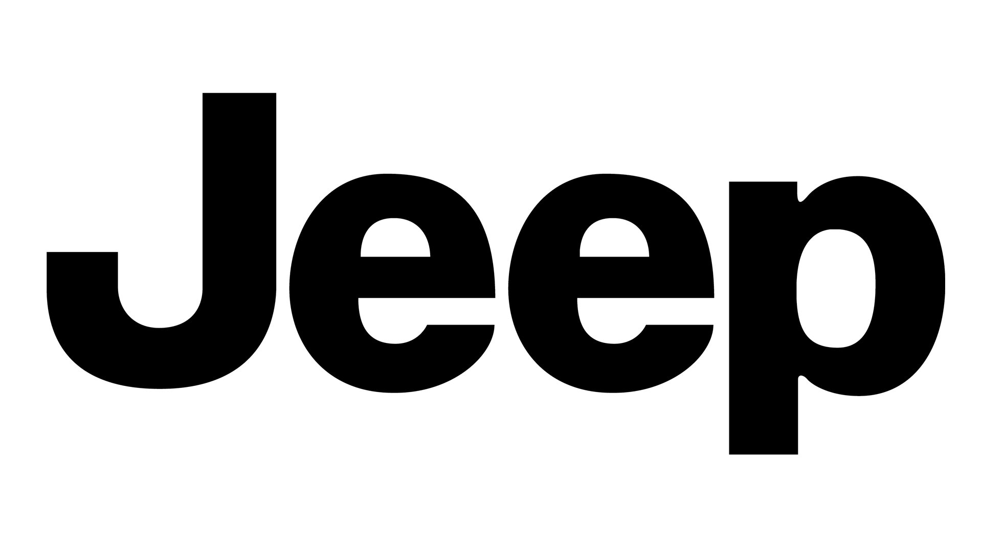
1993 – Today
![]()
In 1993 all elements but the logotype were removed from the Jeep logo, creating a super minimalist concept. There are two official color palettes of the logo: the khaki-green sans-serif inscription on a plain background, or the same style and shapes but in monochrome.
Symbol
Since the brand’s products are off-road vehicles with a four-wheel drive system, it is the image of the off-road vehicle that is the main symbol of the brand. The brand owners did not consider it obligatory to create any other symbolic image. Partly it was justified, because such a product was unique on the post-war automotive technology market. It was this uniqueness that predetermined the success of the brand and even its transition to a household name for all off-road vehicles.
Emblem
From the very beginning of the Jeep brand’s existence its emblem was a font writing of the brand name. Depending on the models, the emblem could vary in size, but its shape remained unchanged. No additional decorative elements were used. It also concerned the frame for the logo itself. The black and later the silver color of the font in the context of a minimalist approach to the logo did not require such additions.
Font
What font is used on the Jeep logo?
The clean and solid Jeep logotype is written in a traditional sans-serif typeface with classic neat contours and bold lines. The font is very similar to Helvetica Bold, Sequel Sans VF Heavy, and Europa Grotesk SH SemiBold.
The main requirement for the font in the Jeep logo was the ease of perception. In other words, the logo should be easy to read. For this purpose a font was created, in which there were practically no sharp angles. It was done specially to emphasize the reliability of the vehicles, their safety. Much later marketing research was conducted the main aim of which was to study the psychology of perception of different types of fonts. The brand’s strategy was recognized as rather effective, both for the new products just entering the market, and for those known for a long time.
Color
![]()
Throughout almost all of its history the Jeep logo featured the black color. This classical color solution was, most likely, due to the fact that the brand owners were simply unwilling to think over a more profound visual (including color) strategy. However, it was laconism and minimalism that distinguished all the first cars of this brand. After all, the main thing was neither luxury nor extra comfort. What did matter were the technical aspects ‒ usability, horsepower and maneuverability.
The modern logo is silvery. This color solution emphasizes the established Jeep brand style.
How many lines does the Jeep logo have?
The primary version of the Jeep logo is composed of a simple yet stable wordmark with no additional graphics. Although, the company also has a secondary badge, where the seven lines are set vertically between two circles. This badge represents the radiator grille of the Jeep vehicles and the circular lights.
What is the font of the Jeep logo?
The stable title case lettering from the primary badge of Jeep is set in a modern geometric sans-serif typeface with clean contours and straight cuts of the lines. The bold fonts from the badge of Jeep are set in a font, which is pretty similar to Helvetica Bold, Sequel Sans VF Heavy, or Europa Grotesk SH SemiBold.


