A subsidiary of InterContinental Hotels Group, Holiday Inn is one of the most well-known global hotel chains. There are over 2.600 hotels now working. The corporation is headquartered in Atlanta, Georgia.
Meaning and history
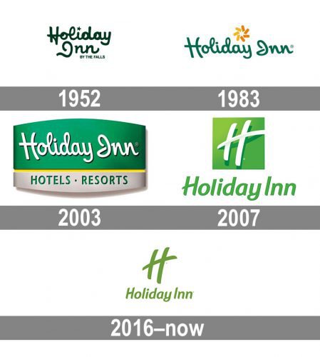
The only constant thing in the Holiday Inn’s visual identity throughout the years is its bright and intense color palette, based on green color, which stands for comfort, success, and growth. All other elements of the famous hotel chain’s logo, have been changed dramatically after undergoing five redesigns.
1952 – 1983
The initial logo for Holiday Inn was introduced in 1952 and featured a colorful and ornate badge with a lot of details. It was a red rectangular rover with yellow vertical stripes and a stylized star on top. The wide green banner with rounded angles was attached to the tower and had a white custom “Holiday Inn” lettering on it. The wordmark was executed in a bold and rounded handwritten cursive and had two white five-pointed stars on the sides.
1983 – 2003
The redesign of 1983 simplified a logo to a green logotype with an emblem above it. The nameplate was executed in the same style of the font, but with contours refined and made more elegant. As for the emblem, it was an abstract flower or swirl-like image, composed of seven petals in yellow and orange.
2003 – 2007
The emblem was gone and the inscription got placed on a green and gray banner in 2003. The wordmark was now written in white and had a delicate black shadow, which made the badge look more dynamic and voluminous. The bottom part of the badge was separated from its body by a yellow line and contained a strict sans-serif “Hotels. Resorts” tagline, set in green.
2007 – 2016
The redesign of 2007 brought a new style of the inscription to the Holiday Inn’s visual identity, writing its logotype in an italicized sans-serif with smooth lines and fancy ends of the letters. The light green wordmark was accompanied by a square emblem, executed in the same shade of green, but with some gradients. The white handwritten “H” with the elongated and rounded horizontal bar was placed on the square.
2016 – Today
In 2016 the brand refreshes its logo, writing the “H” from the emblem in green and placing it on a white background above the lettering. The inscription was also a bit refined, by making its letters smaller and more delicate. The green of the Holiday Inn logo gained a more intense and delightful shade, which evokes a kind and welcoming feeling.
Emblem
The corporation had to replace over 10,000 signs in its global hotel chain. The refreshed Holiday Inn emblem was incorporated into design elements of more than 3,000 hotel lobbies and 400,000 guest rooms. For this, Holiday Inn had to spend around $150,000 per hotel.
Colors
Green has been the dominating color of the Holiday Inn emblem since 1983. The color symbolizes relaxation, harmony, and safety. However, there’s definitely a difference in the shade. The version used in 1983-2007 is darker and cooler, while the logo introduced in 2007 features a sunny, vivid shade of green.
Font
A modern, asymmetric “H” letter dominates the current logo. In addition to it, there is a “Holiday Inn” inscription at the bottom of the emblem made in an attractive customized font style.


