

![]() Bing Logo PNG
Bing Logo PNG
The 2016 version of the Bing logo features teal letters and a stylized “b” on the white background. However, the logotype hasn’t looked the same always.
Meaning and history
![]()
The visual identity history of Bing started in 2009, as before the software was known under the names Msn Search and Windows Live Search. Since its rename into Bing, the engine has had four logo redesigns, which finally lead to a corporate icon, showing its affiliation with Microsoft.
1998 – 2000
![]()
The original logo of the software, introduced in 1998, was composed of two parts: the red and white emblem with the lowercase “MSN” lettering inscribed into a solid horizontally-stretched oval and underlined by the small medium-weight sans-serif “Microsoft” in the title case. The emblem was placed against a white background, above the bold italicized “Search” in black.
2000 – 2001
![]()
Back when this one was adopted, the service was still called MSN Search. The ‘MSN’ part consisted of generously-sized, but lowercase letters, colored blue. On its corner, they drew a wonderful butterfly with the wings colored like the Windows emblem. The ‘Search’ part was also colored blue and written using the usual Windows font.
2001 – 2006
![]()
The redesign of 2001 has slightly refined the MSN search emblem, by softening the shade of blue and rewriting both parts of the inscription in smaller characters. Overall, the composition remained the same, but the logo started looking more delicate and elegant due to the light colors of all elements.
2006 – 2007
![]()
In 2006, they tried selling it as Microsoft Live Search. It used the contemporary emblem of Windows, put inside a grey circle. It was then followed by the full wordmark written in black sans-serif letters.
2007 – 2009
![]()
In 2007, the designers removed the grey circle, made the emblem itself bigger and modified the wordmark. Namely, they got rid of the ‘Microsoft’ bit and adopted the usual Windows font instead of the basic one used in 2006-2007.
2009 – 2013
![]()
The logo, introduced for Bing in 2009, was composed of a friendly rounded wordmark in the lowercase, drawn in bright blue with the yellow dot above the “I”. Its smooth and wide letter-contours made the short word look solid and balanced, while the blue and yellow color palette evoke a sense of reliability and freshness.
2013 – 2016
![]()
In 2013, the company unveiled a concept logo in yellow, with a depiction of a flying boomerang to the left of the lettering. It wasn’t actually used, but in several months a new logo looking somewhat similar to it was adopted. The second 2013 logo was also yellow, but featured a different shade of the color. The initial letter was lowercased, while the boomerang turned into a stylized “b.”
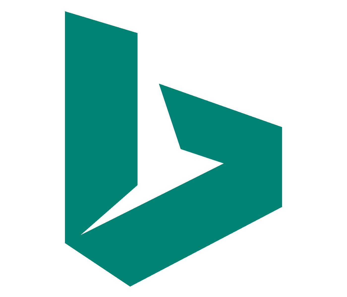
2016 – 2020
![]()
The yellow color of the Bing logo was switched to calm and intense green, and the first letter of the wordmark got capitalized, which added a professional and solid sense to the whole image, and showed the online search engine as a reliable and confident one. The emblem was also refined, becoming more strict, and the sharp separating triangle was removed from its bottom part.
The new green color of the logo stood for growth and success and made the badge stronger and more serious.
Later, in 2020, there will be another version of the same logo created for Bing, it featured a new light gray and white gradient color palette and a three-dimensional emblem, where the iconic “B” was drawn with a smooth curved line. This logo has never been used.
2020
![]()
The Bing logo, used by the platform in 2020, was a copy of the previous badge but executed in a different color palette. The new concept was based on a light-silver and white combination, with a gradient three-dimensional emblem, and a flat gray inscription.
2020 – Today
![]()
The Bing visual identity we all can see today is based on the Microsoft corporate style and boasts a four-colored square and simple gray lettering, consisting of “Microsoft Bing”. The straight square, formed by four smaller ones in red. Green, blue and yellow, today is placed on the logos of all company’s project, which created a wholeness of the brand and makes it stronger.
![]()
Emblem
In early 2016, the logo was tweaked once again. The letters, which were teal now, looked almost exactly as in the previous version, except for the “B” – it was capitalized. The stylized “b” to the left of the logo was also slightly modified: the symbol became more elongated, while the white “cut out” piece disappeared.
Font

The script logo features a customized variation of Microsoft’s corporate typeface called Segoe. The choice of the font emphasized that the Bing logo is part of the Microsoft family. The “i” and “n” look the same as in the Windows logo, while the cut on the top of the letter “b” resembles the “t” in the main Microsoft logo.
Color
![]()
Since 2009, the emblem has gone through several color palettes. The original blue and yellow color scheme was replaced by the yellow one in 2013.


