GoFood is an online food ordering application, which was launched in 2015 by Gojek company, an Indonesian technology giant, founded in 2009. The mobile app has a fancy and bright interface that is easy to use and has millions of users across the globe.
Meaning and history
The visual identity of a popular online food ordering service is modern and stylish. Its red and black color palette was introduced in the very beginning, with the first logo, created in 2016, and stayed with the application after the redesign of 2019. The GoFood logo shows the company as a progressive one, with the young character and the ability to follow the latest trends and to meet the requirements of its audience, which is dynamic and vibrant.
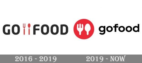
2016 – 2019

The GoFood logo created in 2016 was composed of sleek bold lettering in black, where two parts of the nameplate were separated from each other by a red graphical icon. The icon depicted a fork and a spoon placed vertically in parallel. It was a simple yet perfectly executed graphical representation of what the service does. And the delicacy of the emblem brilliantly balanced the massive and solid lettering.
2019 – Today
In 2019 the logo gets a new life — it is still composed of a black inscription and red emblem, but the composition and style are significantly changed. The lettering is now in the lowercase and there is no space between “Go” and “Food”. As for the emblem, it is now placed on the left from the wordmark and depicts a solid red circle with a white image of a fork and a spoon.
The current GoFood logo looks younger and friendlier than its previous version, due to the use of the lowercase lettering and rounded shapes, which always evoke a sense of warmth and coziness.
Font and color
The new GoFood wordmark is written in a bold sans-serif typeface which is very similar to Galano Grotesque Semi Bold and Carmen Sans Extra Bold fonts with their rounded letter shapes and clean contours.
The black, red, and white color palette shows the service provider as a professional and progressive one, pointing on style, quality, and expertise as the main features.


