

![]() Bed Bath & Beyond Logo PNG
Bed Bath & Beyond Logo PNG
We can’t say that the logo of the Bed Bath & Beyond chain is very unique. Also, it doesn’t give any hint at the fact that the stores sell domestic merchandise. Yet, it does a great job at conveying the brand’s core promise.
Meaning and history
![]()
A store named Bed ‘n Bath started working in Springfield, New Jersey. Warren Eisenberg and Leonard Feinstein, to whom the store belonged, could have hardly imagined that it would turn into a Fortune 500 company and would be listed in the Forbes Global 2000.
The old Bed Bath & Beyond logo was utterly unpretentious. The words “bed ‘n bath” were set in a lowercase sans. The glyphs were rounded and minimalistic. The smaller “tails” of the “b,” “d,” “n,” and “a” were removed. Even the horizontal bar of the “t” lost its left end.
1971 – 1976
![]()
The original logo used the firm’s then-name (‘Bed ‘n Bath’) written tilted serif letters. Below, there was also a motto of sorts written in smaller letters, which said: ‘A new kind of store’.
1976 – 1980
![]()
The 1976 version is just the wordmark, without the motto. The wordmark this time used lowercase sans-serif letters. They were pleasant, round and uniformly wide.
1980 – 1984
![]()
This following logo is the same thing, except squished from the sides.
1984 – 1988
![]()
In 1984, they returned to the old unsquished wordmark, but also added the word ‘outlet’ on the right.
1988 – 1991
![]()
Following the change of its name to Bed Bath & Beyond in 1987, the store chain adopted a new logo.
This time, the words “Bed Bath” were set in a bolder type, which made the design by far better visible and legible at larger distances. The word “Beyond,” which appeared just an addition back then, was set in a stylish cursive script. It wasn’t as legible as the other two words.
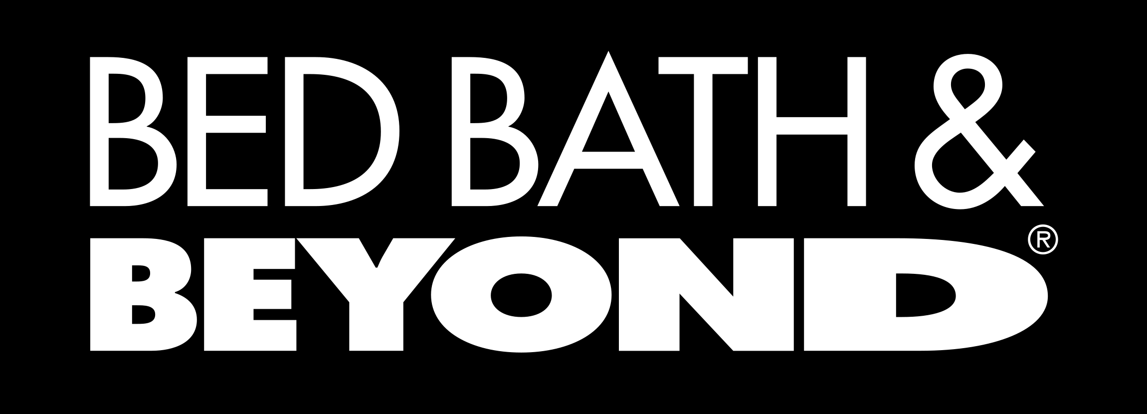
1991 – Today
![]()
In the current logo, the accent is placed on the word “Beyond” – it is bold and looks by far more prominent than the lettering “bed bath &” above. There’s a unique dynamic touch: each glyph in “Beyond” looks wider than its predecessor. The final “d” has been stretched very wide. The bold “Beyond” and the prominent “d” show that the company wants its logo to emphasize the variety of products the stores carry. This message is reinforced by the tagline “Beyond any store of its kind,” which is sometimes added to the main Bed Bath & Beyond logo.
Emblem

In 1988, when the name of the stores was replaced by the one used now, the logo was updated, too. The words “BED BATH” were given in a bold sans serif uppercase typeface, while the lettering “Beyond” featured a curvy script resembling handwriting. Probably the most recognizable of all the letters was the “A”.
Current symbol
Although the 1988 logo looked rather attractive, it failed to reflect the company’s core benefits. The version unveiled in 1991 managed to reach this aim.
If you compare the width of the first and the last letters (especially the “D”), you will definitely notice that every next letter tends to occupy more space. Probably, the most logical explanation to this is that in this way the designers wanted to emphasize the endless variety of goods offered by the stores.
Font
Although the typeface featured in the Bed Bath and Beyond logo is a very popular one (Futura), the designers who developed the wordmark managed to customize it to the level of uniqueness and even put a message in it.
Color
![]()
Deleted: The rich shade of dark blue has a hardly noticeable violet hue in it. Against the white background, the blue color looks legible enough. The original logotype featured dark red, which was replaced by black in 1988.


