DiDI is the name of a Chinese company, which was established in 2012, and is specialized in such services as taxi, car rent, and delivery. Working mainly on the Uber principle, today the company has its subsidiaries in more than 15 countries, including Mexico, Brazil, Egypt, and Russia.
Meaning and history
DiDi was formed as a result of a merger of two competing Chinese companies, Didi Dache and Duaidi Dache in 2012. The first name of the newborn company was Didi Chuxing, which turned into DiDi Global a few years later. Today this Chinese transportation company, based in Beijing, provides mainly car rental and taxi services.
DiDi operates in more than a dozen of countries across the globe, focused mainly on the Latin American region, and offers its services through a mobile app, available for both iOS and Android operational systems. You can get authorized car or cab services through an application, which works like other famous apps like Uber, Bolt, and Cabify.
DiDi offers several services, although most of them are taxis: DiDi Premier provides users with a luxury car service and specialized assistance, DiDi Bus or DiDi Microbus is a service for a group of people, and regular DiDi Taxi, which is also known as a DiDi driver, DiDi Express, which is a well-priced mobile network for individuals or groups of up to 4 passengers plus a driver.
Apart from taxi services, DiDi offers the following ones: DiDi car rental, DiDi Enterprise solution for corporate customers, and DiDi Food, a home food delivery service, which is available in China and some Mexican cities. The company plans to expand its service to all of its locations across the globe.
What is DiDi?
DiDi is the name of a Chinese transportation company, which works mainly as a car rental and taxi provider. The company was founded in 2012, and by today has grown into a global player, having its services available in several Asian, Latin American, African, and European countries.
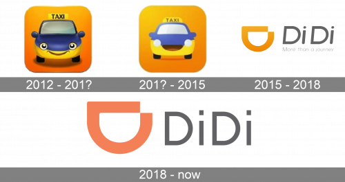
In terms of visual identity, despite its young age, DiDi has already run four redesigns, trying to be up-to-date with the latest trends in logo design. The company started from a very intense and full of details badge, which turned into a minimalistic geometric badge, looking professional and cool.
2012 – 201?
The very first DiDi badge was introduced in 2021 and featured a bright caricaturist composition with a smiling car, drawn in blue and yellow on a solid orange square with rounded angles. The top of the car was decorated by a yellow rectangular banner with the bold uppercase “Taxi” lettering in black sans-serif.
201? – 2015
The logo with a smiling car was refined, with the shades getting lighter and more vivid, and the yes in the car’s face replaced by two solid white circles. The “Taxi” lettering has also been refined, with the lines of the letters getting thinner, and more space between the characters added. This version of the badge has stayed with the Chinese company until 2015.
2015 – 2018
The redesign of 2015 has brought a completely new style to the DiDi visual identity. The new badge was composed of an abstract emblem, looking like a horizontally placed letter “D’ with its arched side facing down, which made it look like a smile. The letter has a small square cutout in its upper-right part. The emblem was followed by a slightly italicized sans-serif logotype in a calm shade of gray, with the “More than a journey” title case tagline, set in the same color, but with thinner lines.
2018 – Today
In 2018 the DiDi badge gets another redesign, with the orange gradients of the emblem replaced by a solid bright hue, and the logotype rewritten in a more stable and straight typeface, keeping the gray color. The tagline was removed, and the emblem in this version for slightly enlarged.
Font and color
The DiDi lettering from the primary version of the app’s logo is set in a clean and modern sans-serif font, which is very similar to such iconic typefaces as Frutiger Pro 55, Roman Iwata UD, Gothic Text Pro Medium, and Ideal Medium. The main peculiarity of these fonts is that the dots olive the lowercase “I”s here are square.
As for the color palette of the DiDi visual identity, it is based on a combination of orange and gray, where orange stands for the happiness of the clients and is used for the abstract smiley emblem, while the straight and laconic logotype is set in gray, evoking a sense of professionalism and reliability.


