Sherwin Williams is the name of an American company, which is engaged in the manufacturing of paints and coating for interior and exterior design. The company was established in 1866, and by today has almost 5 thousand stores across the USA and other countries.
Meaning and history
 Sherwin Williams is the company with a strict strategy, which only allows the products of the brand to be sold in its official stores, and this is what makes it so different from others and so successful.
More than 150 years in the industry of paints and varnishes, most of which Sherwin Williams is the leader in its segment. All this time the company has been developing, improving the quality of products, and introducing advanced technologies in its production. The result – environmentally friendly production and exclusive paint products that combine decor, practicality, safety, and the latest technology.
What is Sherwin Williams?
Sherwin Williams is one of the most reputable companies on the American market for paints and coatings for various surfaces. The company, founded in the middle of the 19th century, has grown into a real giant, with more than 4,500 locations across the country and showrooms on different continents.
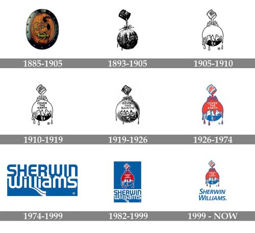
In terms of visual identity, the company has been as intense and “colorful”, as the palette of its products. The logo of Sherwin Williams was redesigned more than half a dozen times, although the idea of the iconic badge was brought out at the beginning of the 1890s.
1885 — 1905
The original Sherwin Williams badge was designed in 1885 by one of the co-founders of the company, Henry Williams. The logo features a delicate image of Chameleon, placed on an oval medallion with a wooden background and a thick metal frame. The reptile was set under the two levels cursive inscription, written diagonally in the same copper-like metal, as the frame and the chameleon. The choice of the symbol for the logo was pretty understandable, as not a single more creature on the planet reflects the ability to change colors, just like the products of Sherwin Williams.
1893 — 1905
The first version of the iconic “Cover The Earth” logo, created by George Ford, was introduced in 1893, and became a secondary badge for the company, along with the emblem, designed in 1885. It was a drawing of the paint spilling on the globe from an open paint-can, placed above it. There was no lettering and no additional symbols, just a brilliant graphical representation of the company’s purpose.
1905 — 1910
The “Cover The Earth” logo was redrawn and became primary in 1905. The contours of all elements were cleaned and emboldened, with more white shades added to the composition, and the “SW” initials written over the paint can. There still was no lettering on the badge, so the inscription on the can was the only “business accent” of the emblem.
1910 — 1919

In 1910 the iconic badge is being redrawn again, and this time the lettering “Cover The Earth” was written over the upper, covered with paint, part of the globes in three levels, being executed in the uppercase of a bold outlines sans-serif typeface. All other elements remained untouched, just slightly enlarged, thus the “SW” monogram on the paint can become more visible.
1919 — 1926
The globe on the logo was redrawn in a more detailed way, with the names of the continents and oceans added to it. Both elements of the badge got enlarged, and the “SW” monogram was replaced by the “SWP” after the name of the company was switched to Sherwin Williams Paints.
1926 — 1974

In 1926 the iconic logo was drawn in red, blue, and white, with the contours of the elements emboldened and cleaned. The outlined inscription turned into a flat white one, making the badge look more modern, clean, and strong. The lettering over the globe and its meridians was removed.
1974 — 1999
In 1974 the globe badge was replaced by the two-level logotype in blue and white. The upper level featured an uppercase blue “Sherwin” in a cool custom sans-serif typeface with arched lines of the letters. The bottom “Williams” was written in white over a solid blue background, with both letters “I” in the lowercase, and the dots above them drawn as squares. The tails of both letters “L” were elongated and stretched diagonally to the bottom right side, looking like two parallel waves, smooth and elegant.
1979 — Today
After a short break, the company decided to bring back its emblem, introduced in 1926. It was kept in its original version, with no changes applied. The logo in red, white, and blue can still be seen today on the company’s products and advertising materials.
1982 — 1999
The two logos were United into one emblem in 1982. The iconic globe was set above the blue and white two-levels logotype on a solid blue background. The emblem was outlined in white to be more distinctive on a bright background, while the white horizontal banner was added to the upper line of the Sherwin Williams logotype.
1999 — Today
 The blue background was switched to a white one in 1999, and the complicated stylized logotype was rewritten. Now it was the iconic globe in blue and red, set above the italicized sans-serif Sherwin Williams inscription in a simple clean sans-serif typeface with lots of air between the letters.


