Zeiss is a Herman brand of optical equipment and lenses manufacturing company, which was established in 1846z today the brand distributes its products all over the world as well as supplies its lenses to the world’s biggest companies.
Meaning and history
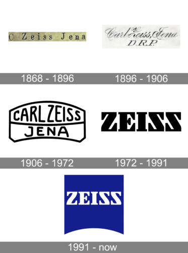
The company was started in 1846 by one Carl Zeiss. It’s been for a long time a leading manufacturer of optics in Germany. The company’s full name is identical to that of its founder; it doesn’t have any innate meaning. The company is considered one of the most reputable manufacturers of optics in the country.
1868 – 1896

Their earliest distinctive mark depicts the company’s name, ‘C. Zeiss Jena’, written in a single line of typographic text. The ‘Jena’ part in the name refers to the town where the company was founded and where it operated for much of its history, Jena in central Germany. The products were routinely stamped with this wordmark.
1896 – 1906
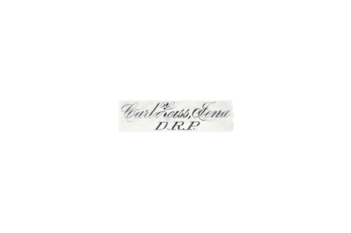
In 1896, they’ve adopted a new stamp, which instead said ‘Carl Zeiss Jena’ and then right below that ‘D.R.P.’ The former was written in a very complex, elegant hand-written script with very thin letters. The latter instead used a more mundane serif script. The letters stood for ‘Deutsche Reichs Patern’ (‘Patent of the German Empire’).
1906 – 1972

1906 saw the first actual emblem Zeiss ever used. It was a vaguely rectangular plate that was bent downward. This naturally created curvature, and the text within this figure was also warped. The inner part was divided widthwise by a largely straight horizontal line. Because of it, the words ‘Carl Zeiss’ in the upper part were inflated near the center, whereas ‘Jena’ beneath had an opposite effect.
The font was a much simpler, smooth and rounded script.
1972 – 1991

In 1972, Zeiss adopted the script they’ve used even into the 20th century, although later on a different logo. This one was just their short name, ‘Zeiss’, written in a very bold, blocky font where the letters ‘S’ were identical (but mirrored) to the letter ‘Z’, creating a pleasant sight. The letters in general were very symmetrical in this design. They’ve colored it fully black.
1991 – Today
The Zeiss visual identity is instantly recognizable across the world. It is modern, bright and laconic. Composed of a white wordmark placed on a blue square, the logo has a few details, which make the brand’s visual identity unique and special.
The Zeiss wordmark in all capitals is executed in a bold serif typeface with smooth sleek lines. The font of the lettering is close to Clarendon Black, but with modernized shapes of “Z” and “S”, which looks like a mirror of each other.
At the bottom of the blue square, there is a white arch, which represents the field of the company, symbolizing a lens.
The bright contrast of blue and white makes the logo fresh and crispy, evoking a sense of professionalism and authority. Blue is known to be the symbol of reliability and stability, while white is a color of unity and loyalty.
The Zeiss logo is minimalist yet full of meaning and power. It looks eye-catching and memorable. The logo of the company is modern and doesn’t need any extra detail to stay actual for many more years.
Font and Color
The font Zeiss used since the 70s is a very powerful serif with bold, big letters. The lines are straight, the angles are perfectly square in most cases, and the characters are notably symmetrical. They’ve come up with it to symbolize the clarity and their commitment to absolute precision.
Zeiss has only started using the color blue in the 90s. Before it, all the logotypes they ever used were black with white elements.


