The Yelp corporation hasn’t experimented much with its logo so far. The original design, which was introduced around the company inception, was replaced in several months by a new logo that has remained almost unchanged since then.
What is the symbol of Yelp?
The symbol of Yelp is a stylized minimalistic image of a red flower with five smooth petals. Initially, it was thought to be a star, consisting of five triangles with rounded angles. The designer was inspired by the star from the Calvin and Hobbes comics, although each time he tried to draw it, he came up with something looking more like a flower.
Meaning and history
The original logotype was created around the time when the company was founded. The cartoonish emblem was developed by Chad Hurley, cofounder of YouTube. The name of the company, which was given in yellow capitals with a thin black frame, was followed by an exclamation mark. The lettering placed in a speech bubble stretched outside the borderline.
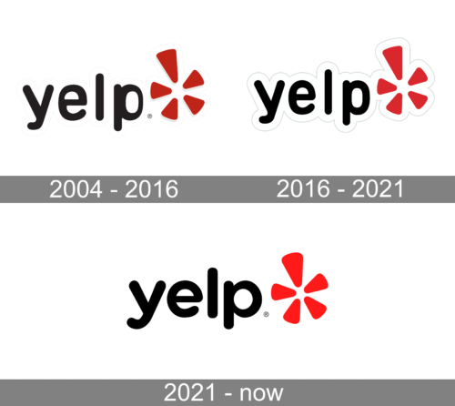
2004 – 2021
 In fact, the current emblem doesn’t look exactly as Michael Ernst designed it back in 2004. There’ve been a couple of minor modifications and versions.
2016 – 2021
The redesign of 2016 has cleaned up and modernized the contours of all elements on the Yelp logo, and brightened up its color palette, replacing the dark shade of red in the emblem with a more vivid one. The lettering was slightly refined, getting more balanced now, and the whole composition was now outlined, making up kind of a white cloud.
2021 – Today
In 2021, they removed the strange white sticker-like outline around the logo. Also, the letters were darkened and made more proportional, which greatly benefits them.
How was the logo developed
The iconic design with a burst was developed by Michael Ernst, who was the company’s creative director at the time. Ernst was hired by the Yelp co-founder and CEO Jeremy Stoppelman in 2004, when it was just a start-up. The designer was asked to give both the brand and its web resource a new look.
Ernst created almost a hundred sketches varying in the core metaphor and design elements. Some of the sketches developed the idea of speech balloons, but Stoppelman didn’t want to dwell upon it. Some other ideas included abstract shapes and even a dog (with a reference to the noise it makes). Also, the team wanted to replace the exclamation mark with something more recognizable.
Eventually, Ernst found the inspiration for the design in comic books, where a little star was shown above a hero’s head whenever he discovered something interesting. It also seemed to conjure up an idea of self-expression, of bringing your opinion into the world. The earliest versions of the burst design looked too much like a flower, so the designer tried to move in the direction of a more abstract shape.
Primary symbol
The current Yelp logo features the brand name in rounded lowercase letters given in black. To the right, there is a burst symbol resembling a flower or a pizza. Both the lettering and the image have a white outline. They are given on the red background. Alternatively, the full color logo can be given on the white background. The brand guidelines do not recommend any other color versions or additional transformations.
Burst emblem
When the primary logo doesn’t fit (for instance, in social media or in case of size or format restrictions), the burst icon is used. Typically, the burst is white in a red square with rounded corners. A red burst on the white background may be used as an alternative.
Icon
The icon of Yelp is instantly recognizable regardless of the color palette it is used in. As there are two possible schemes — white and black and red and white, where colors can be used in reverse, which makes the number of possible icon versions equal to four.
The icon itself is a stylized flower of five petals, the one we can see on the official logo, with one petal elongated. It can be drawn in black and placed on a plain white background. It can also be depicted in white on a solid black circle, or a white flower set on a scarlet red square with rounded angles.
Font
As Ernst later explained, his original intention was to use only capitals, except for the “e” – he wanted it to be lowercase. He also considered several slab serif treatments. Yet, eventually he came to the rounded font Mesmer, which created a relaxed, laid-back mood. He didn’t leave it as it was, though, modifying the glyphs to give them a “touch of irreverence.”
Colors
In addition to white and black, the Yelp logo features an eye-catching shade of red (#d32323).
What do the symbols in Yelp mean?
The abstract symbol on the primary Yelp badge can be taken for a flower, a Sun, or a star, but according to the company, this element is a star, which was inspired by the star from its ye comics history about Calvin and Hobbes. This is a symbol of a brilliant idea, a spark, a sudden insight. And the red color of the graphical element on the Yelp badge only elevates the meaning and makes the look of the logo even stronger, brighter, and more progressive.


