Verisign is the company, specialized in domain names registry, internet infrastructure, and security services. It was established in 1995 in the United States and today has an annual revenue of about one billion USD.
Meaning and history
Verisign is an American company that registers Internet domain names and manages identification and authentication systems. It was founded in 1995 and is now one of the largest domain name registrars in the world.
In 2000, Verisign bought NetworkSolutions for $20.8 billion, which was the monopoly operator for the .com, .net, and .org domains. A little later, in September 2003, the company launched Site Finder Service. Every time a user accessed any unregistered .com domain name, they were redirected to Verisign’s proprietary search engine.
Verisign is a company that maintains network infrastructures, DNS root servers, many well-known domains and their server systems, and website security. Of the twelve root server operators, Verisign is the only company that maintains more than one server.
1995 — 2012

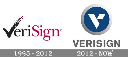
The old logo looked nothing like the current one. The previous version featured the word “VeriSing” broken down into two parts by color (black for the lettering “Veri” and maroon for the lettering “Sign”).
The “V” had a unique touch due to the extended top right end formed by multiple maroon and black cubes.
2012 — Today
The Verisign visual identity shows the company as professional and loyal. It’s strict geometric shapes and calm color palette evoke a sense of trustworthiness and reliability.
The Verisign logo is composed of an emblem and a wordmark, which is usually placed under the emblem or on its right side.
The nameplate in all the capitals is executed in a strict and solid sans-serif typeface. The gray color of the lettering evokes a sense of stability and security, making the whole logo feel lighter at the same time.
The Verisign emblem, enclosed in a thick white and gray gradient frame, depicts a stylized letter “V” on a blue background. The right bar of the “V” is segmented and has a triangle cut off it.
The blue-white and gray color palette of the Verisign logo represents a confident and powerful company, which values expertise and innovations.
It is a strict and timeless visual identity, which is built around the principles of simplicity and strength.
Font and color
The primary logo of Verisign is just a graphical emblem with a stylized geometric letter “V” on it. However, sometimes you can see the emblem accompanied by quite a modest uppercase lettering in gray. The inscription is set in a bold geometric sans-serif typeface, which looks similar to such fonts as Basic Commercialtrade, or Gothic 725.
As for the color palette of the Verisign visual identity, it is a combination of smooth blue, white, and gradient gray. This scheme evokes a sense of excellence, professionalism, and trustworthiness.


