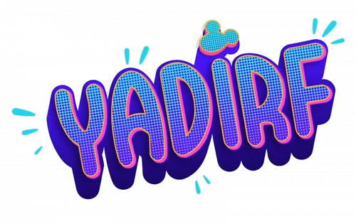
Yadirf is the name of a discontinued night program, which ran on the dismay channel in the period from 2019 to 2020. The program was focused on showing some of the Disney popular shows. The name of the channel is “Friday” backward, which explains in a Friday night schedule.
Meaning and history
The hard-spelled name of Disney’s show was made up of a word Friday, written backward, to point at the show’s release time — Friday nights. The main focus of Yardif was on the most famous Disney shows and their new episodes, though the project hasn’t gained success and got discontinued nine months after its launch.
The history of the Yardif visual identity is as short as the life of the program itself — created in September 2019, and never been redesigned. Despite the unsuccessful concept of the show, its logo was bright and eye-catching, the one that could become instantly recognizable all over the world, if it had time for it.
2019 – 2020
The Yadirf Emblem, designed in 2019, featured a fancy hand-drawn logotype, which was placed diagonally, in the upright direction. The inscription was written in all capitals of a custom sans-serif font, looking like a very discreet and modest graffiti.
Though all of the letters in the wordmark were written in the uppercase, above the “I” the iconic Disney symbol was placed, a Mickey Mouse head, which was also diagonally oriented. The symbol featured a light blue color, with a yellow and pink outlined which made it more visible on a purple and pink emblem.
There were also some blue strokes around the Yadirf lettering, which balanced the shade of Mickey’s head, and added a sense of playfulness and dynamics to the whole image.
Font and color
The Yadirf visual identity is based on a custom handwritten typeface, where the uppercase letters are drawn in bold and narrow sans-serif style with clean smooth contours, softened angles, and a very kind and friendly mood. The outline of the letters plays a big role in making the whole inscription look distinct and bright.
The purple, blue, and pink color palette of the Yardif logo could have looked too dark and heavy if not for the use of light gradients. In the end, the whole composition looks vivid and sleek, evoking a sense of creativity, and bringing an entertaining and artistic mood.
Purple is a color, which stands for imagination and wisdom, while pink represents passion and love. As for the blue, it is a symbol of freedom and evolution. So together these three colors made up a great team in reflecting the essence and purpose of one of the Disney programs.


