RWBY is an anime-styled animated web series and media franchise. It was developed by Monty Oum, a web-based animator and writer, for the Rooster Teeth. The RWBY logo has been preserved virtually unchanged since it was first introduced.
Meaning and history
The first episode was released on the Rooster Teeth’s official website in 2013. The franchise has a wordmark logo without any pictorial elements. It is often placed in various visual contexts (for instance, over the depictions of the main characters), so the lack of the pictorial part in the logo is only natural.
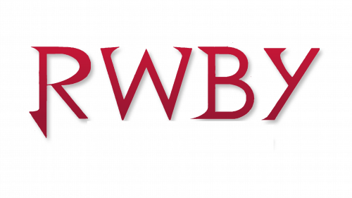
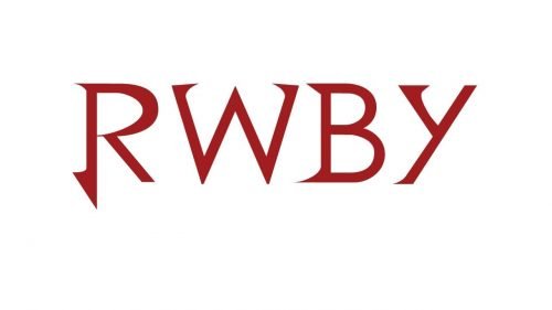
The letters, however, are picturesque in themselves. They have distinctive sharp “thorns” on the ends. The “thorns” are of various shapes and widths, yet all of them are pretty sharp.
The widths of the strokes forming the glyphs are more or less the same, with the exception of the top of the “R,” where a very thick stroke is combined with a very thin one.
The RWBY logo is typically white on the multi-color background, but can also feature other colors, for instance, dark red.
What is RWBY?
RWBY is the name of an American computer-animated series in the anime genre, which was created by Monty Oum in 2013, and released by Rooster Teeth, a digital media production company from Texas. The action-adventure series tells a story about young people training to become warriors.
Font and Color
The custom sharp and sleek lettering from the primary RWBY logo is set in an elegant edgy designer font with elongated bars, and pointed ends of the lines, resembling irregular arrowheads. The closest fonts to the one, used in this insignia, are, probably, BB book Text BB book Text, or Kingthings Serifique Pro Regular, but with some significant modifications of the contours.
As for the color palette of the RWBY visual identity, it is based on a dramatic red-to-black gradient, which looks very sophisticated and chic, at the same time evoking a sense of power and danger.


