

![]() Xing Logo PNG
Xing Logo PNG
Xing is a social network focused primarily on professional contacts. Its parent company is New Work SE, which is headquartered in Hamburg. The main market is German-speaking countries.
Meaning and history
The Xing logo is an example of a minimalist modern logotype. It is clean and easy to grasp, yet efficient. In spite of its simplicity, it manages to have a more or less recognizable icon, which is something that is difficult to achieve given current design trends.
What is Xing
Xing has been known as a Hamburg-based social networking platform with an emphasis on professional networking. It offers free basic membership, but several key functions are available for paid members only.
2007 – present
![]()
After the brand was renamed and adopted a new logo, it has always been loyal to it. This approach helps to retain customers, who might have been lost after a logo update. Also, the loyalty of this type often indicates that the design does its job and there is no need for improvements.
In the main Xing logo, the majority of the space is occupied by the name of the brand. The wordmark would have looked utterly generic if not for the color, dark teal. The emblem makes the individual style of the design even more tangible by adding a lighter shade of green. It is rather warm and also more vivid than the one used for the wordmark. As a result, it becomes the accent for the whole design.
The emblem is based on a rather generic shape, an arrowhead. Here, two arrowheads, a smaller one and a larger one, are oriented in opposite directions. Their sharpest points are positioned at slightly different levels, which make the arrowheads form something that may be interpreted as a link of a chain.
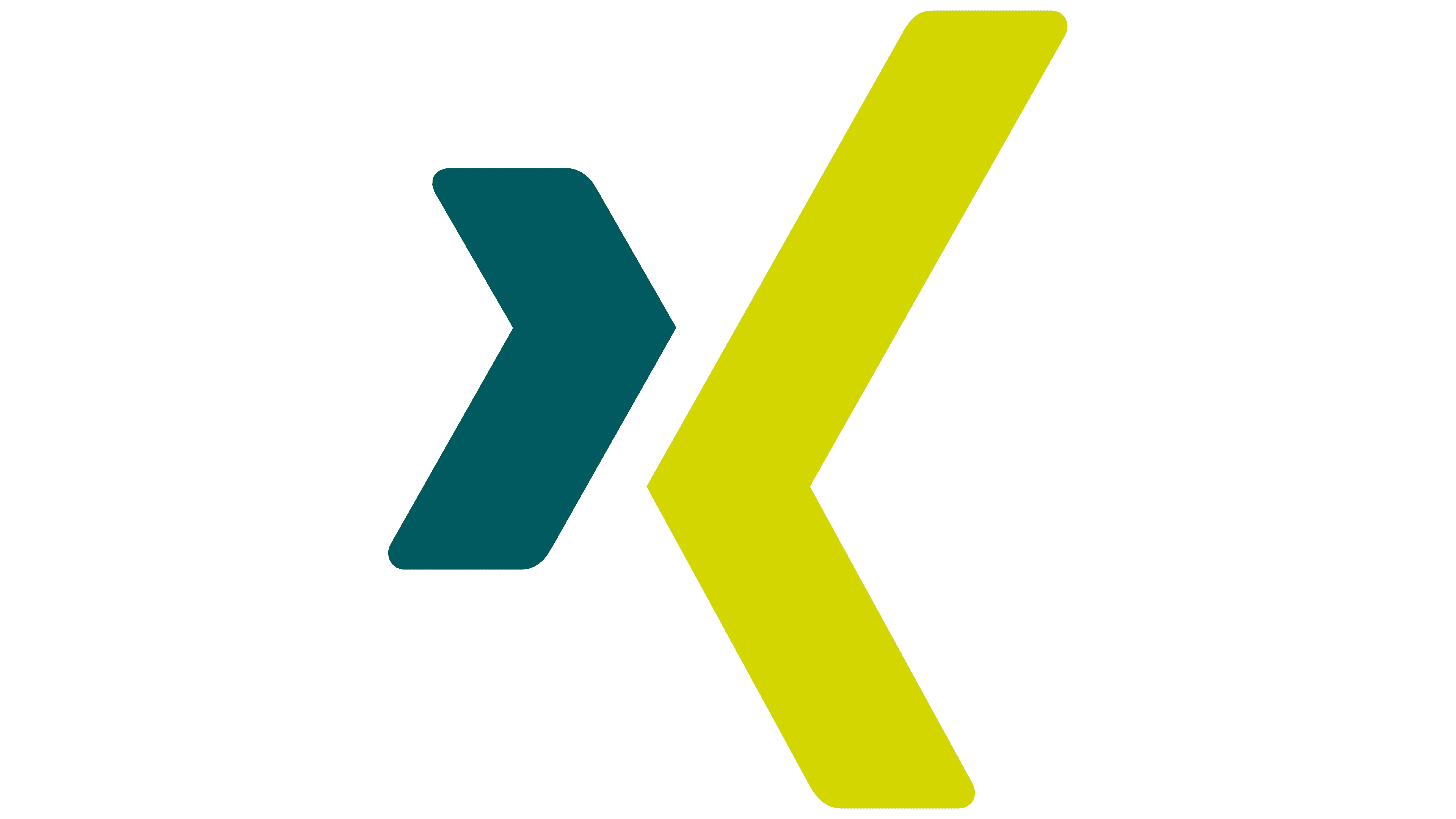
The linking theme is of paramount importance for the brand as it has to convey the idea of professional networking. Yet, we can’t say it’s very obvious here. Also, the company with such a specialization might have introduced the “synergy” theme in its logo. Arrowheads looking in the same direction would have worked better, in this case. Although it still wouldn’t be that easy to make such a design unique.
Icons
![]()
In addition to the full logo lockup, where the wordmark is placed next to the emblem, there are also versions where the emblem is used on its own.
One version of the icon showcases the arrowhead emblem in white placed inside a square box filled with a teal gradient. The darkest parts of the filling are of the same color as the wordmark, while the majority of the space inside the box is lighter.
In the second version of the icon, the arrowheads are of the same colors as in the original full logo lockup, while the filling is a white and light gray gradient. The website icon also features the arrowheads in teal and grass green, but the background is all white.
Colors and font
The wordmark is set in an austere all-caps sans serif typeface. It is bold enough to provide perfect legibility, but not the least beat bolder than that. The glyphs are based on the rectangle. The basic shape of the ends of the letters is also the rectangle, although they are subtly rounded.
The dark teal is not as popular as some other colors, like bright red, blue, or a more straightforward green. So, it provides a touch of individuality for the Xing logo, especially when paired with grass green.


